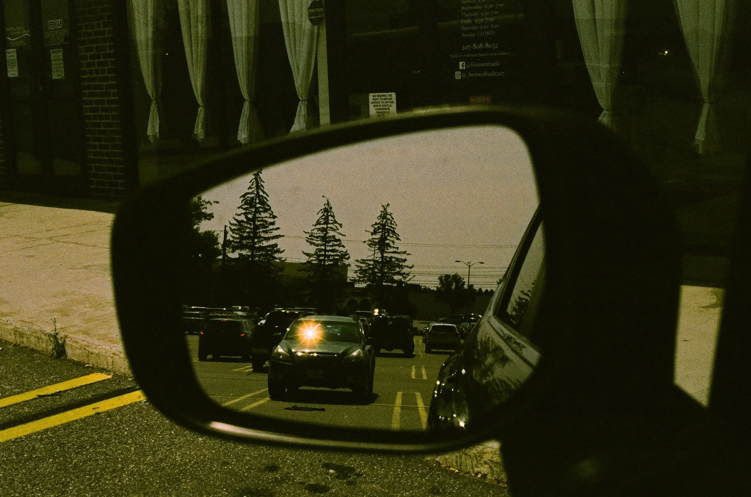
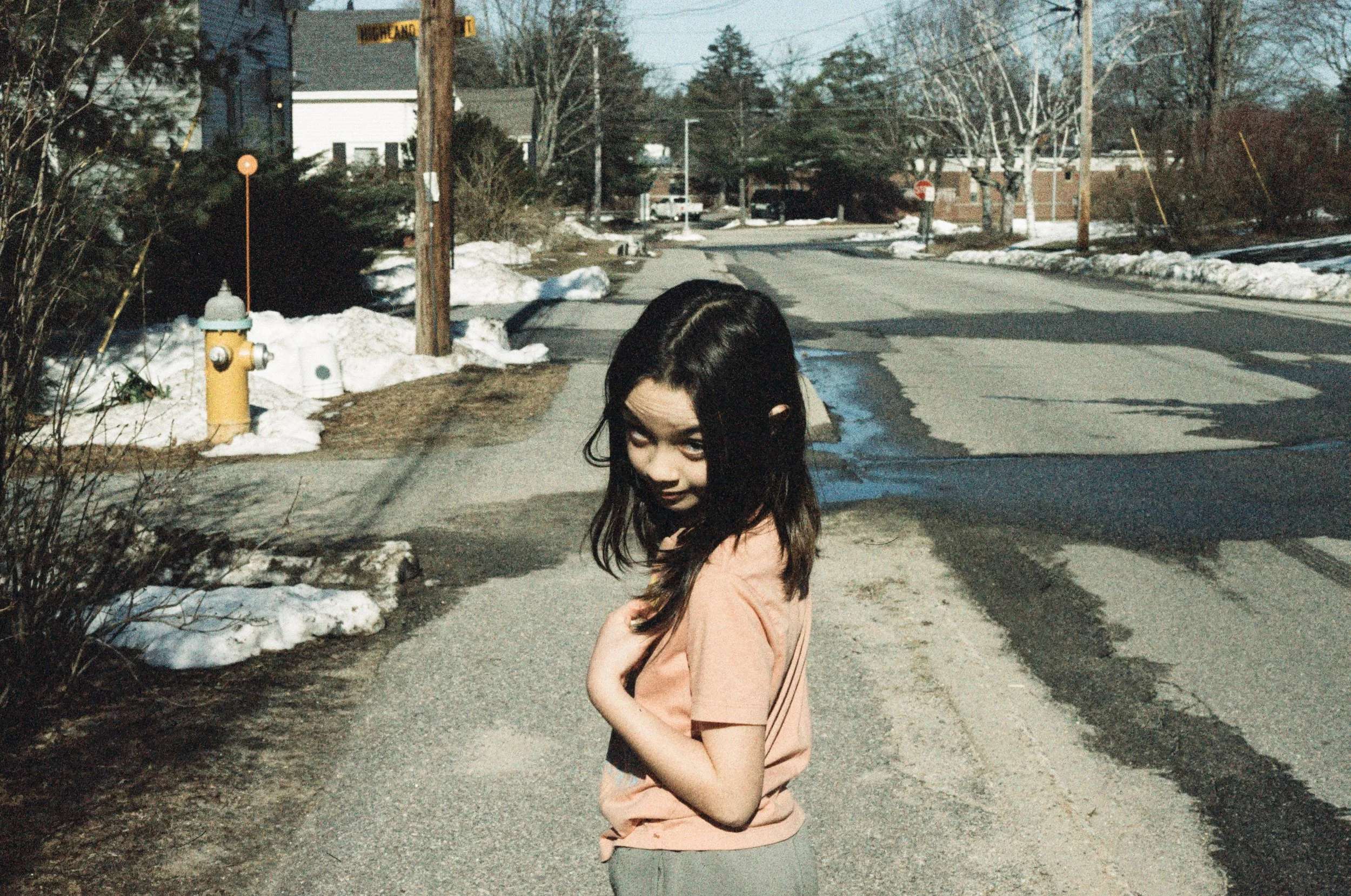
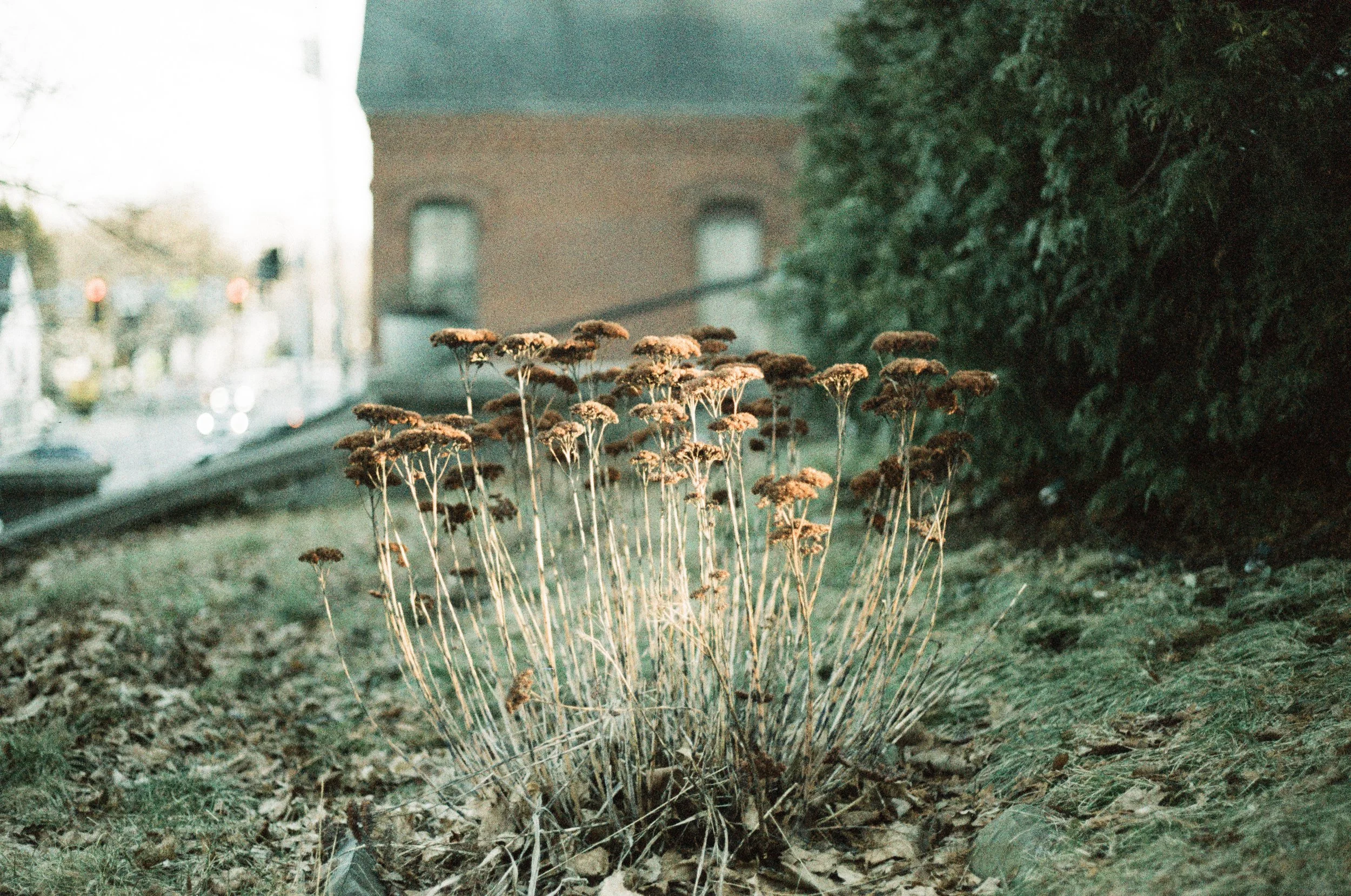
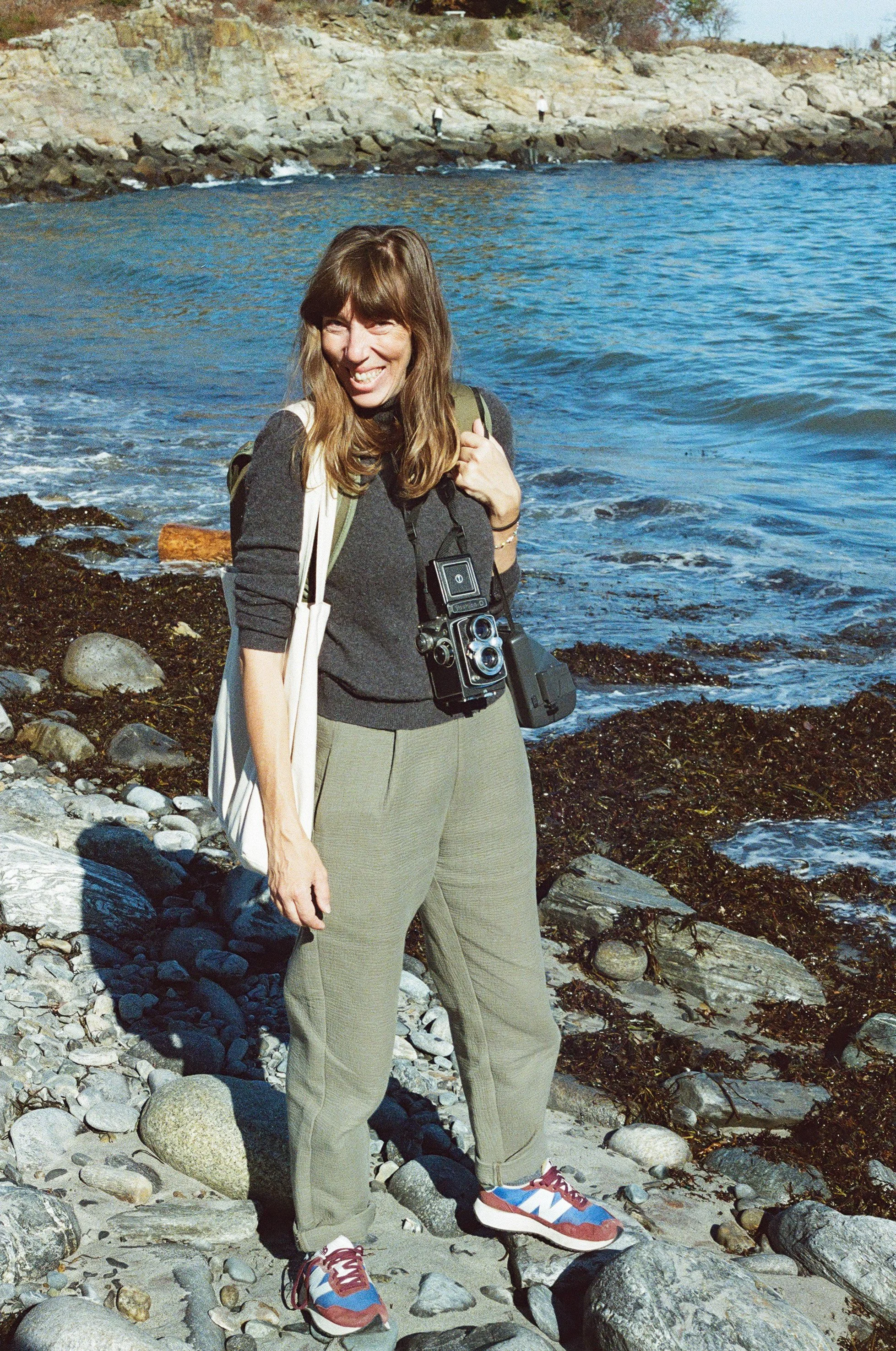
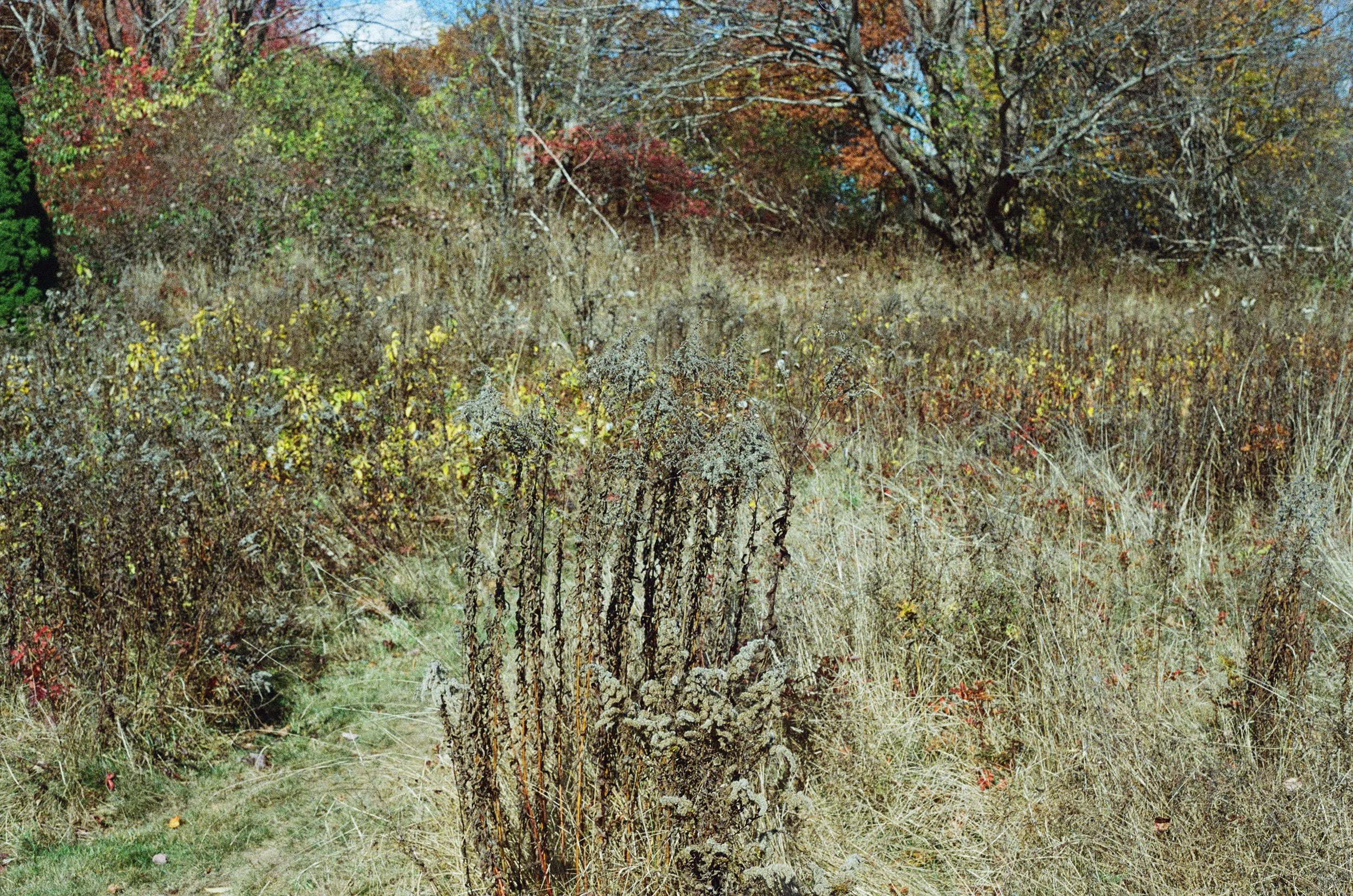
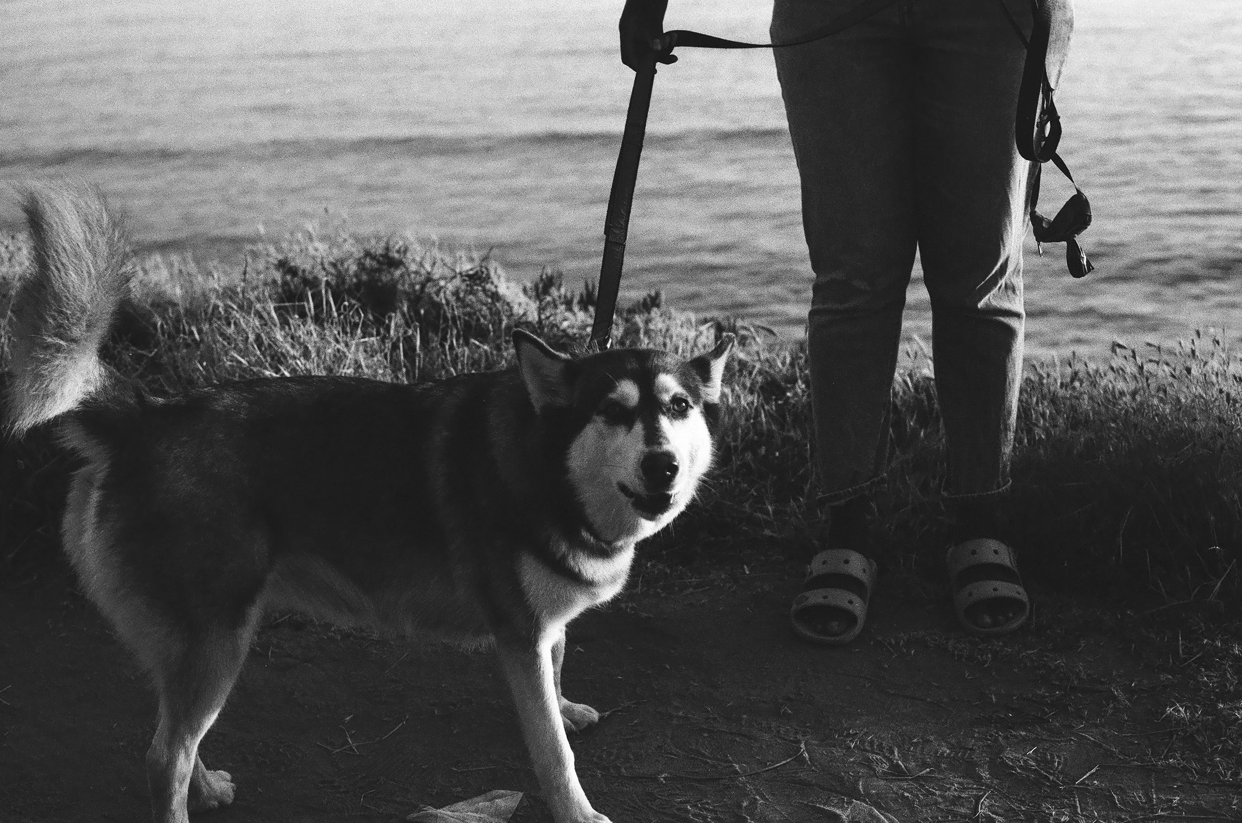
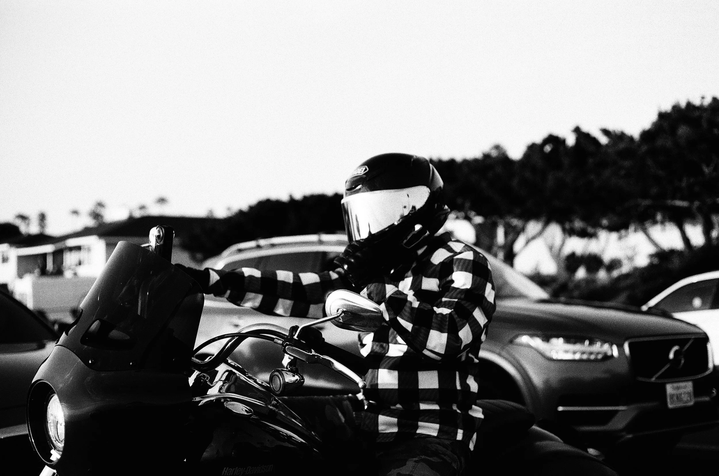
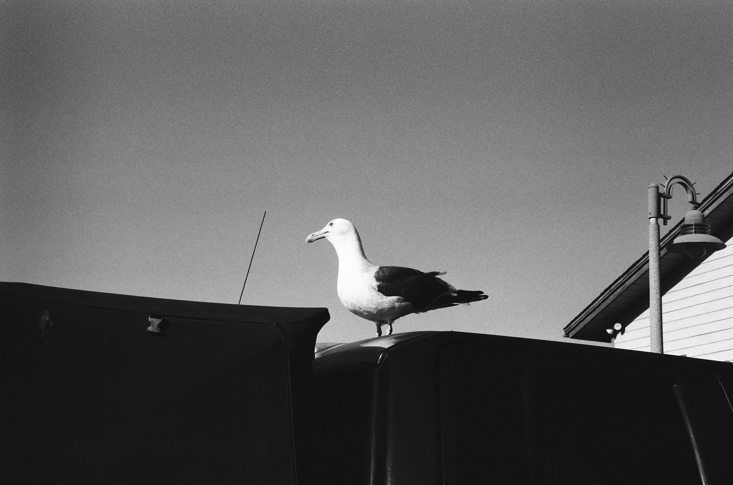
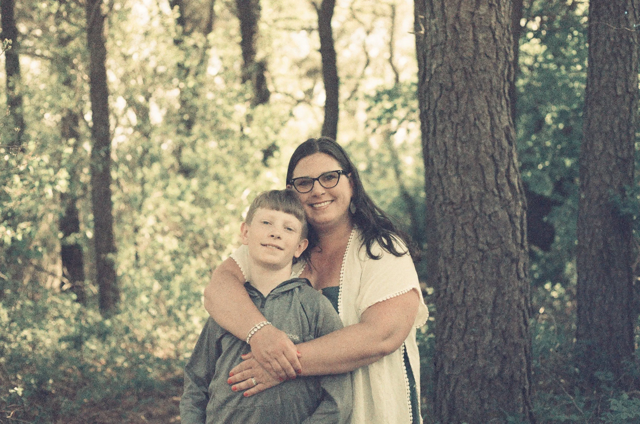
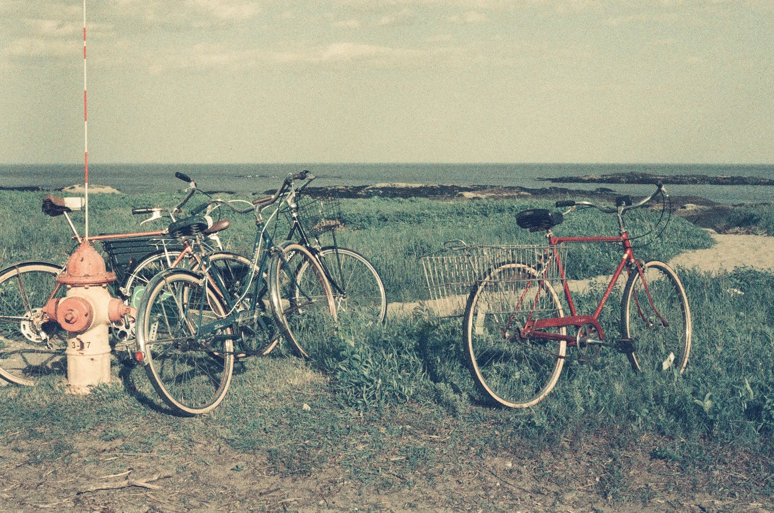
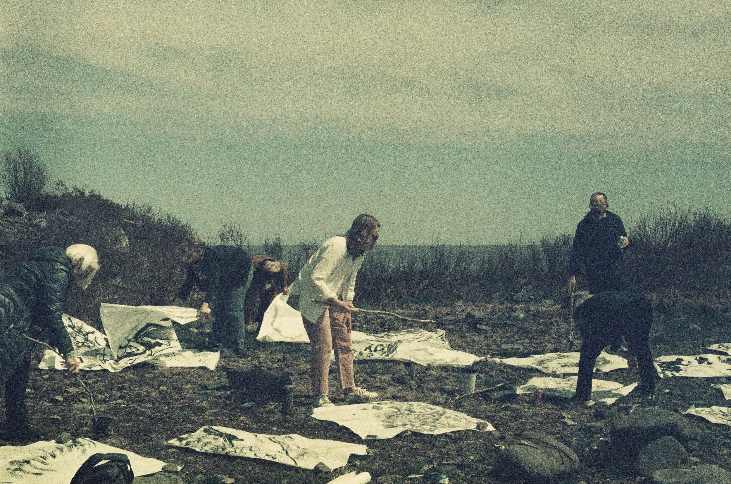
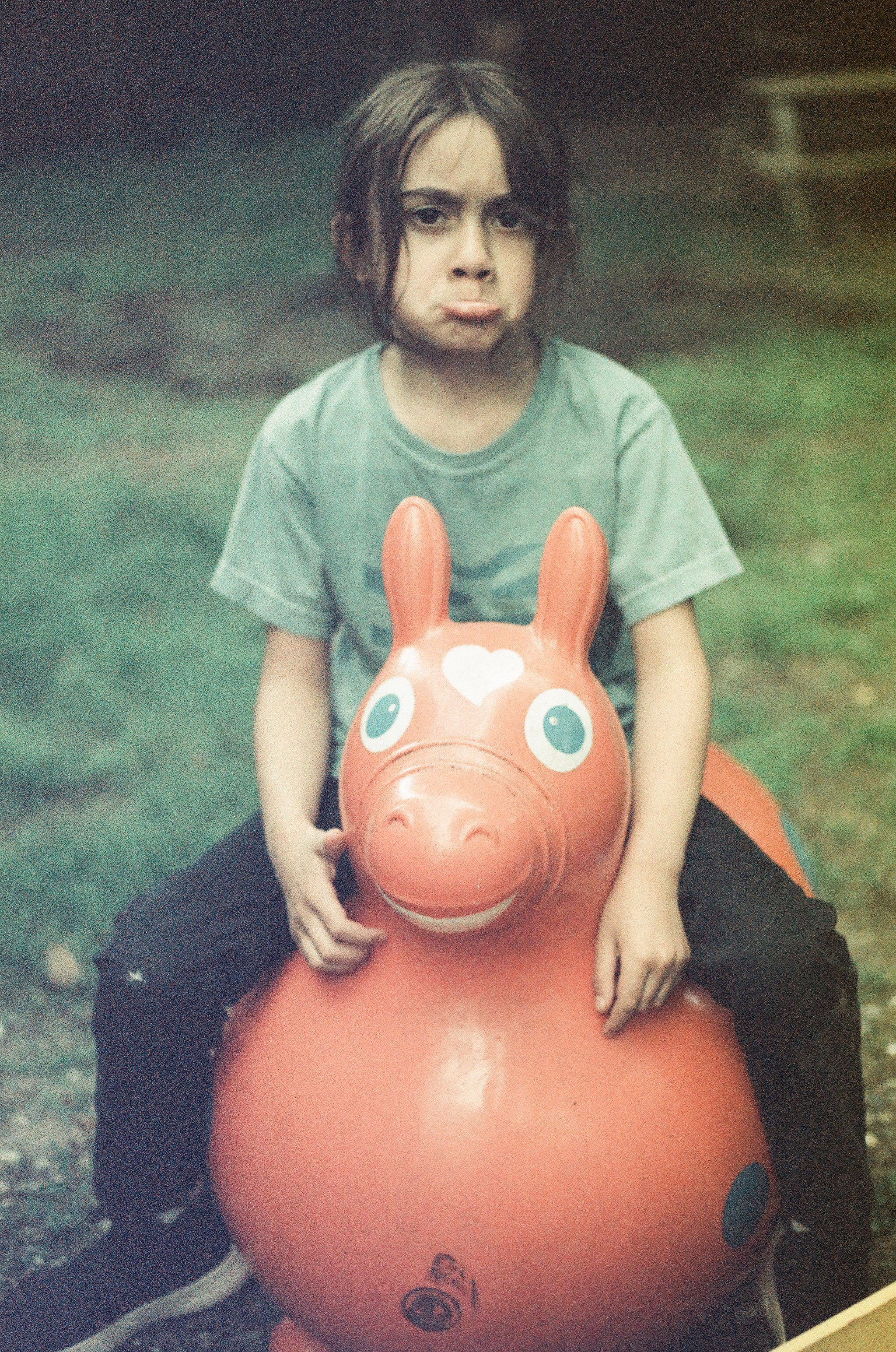
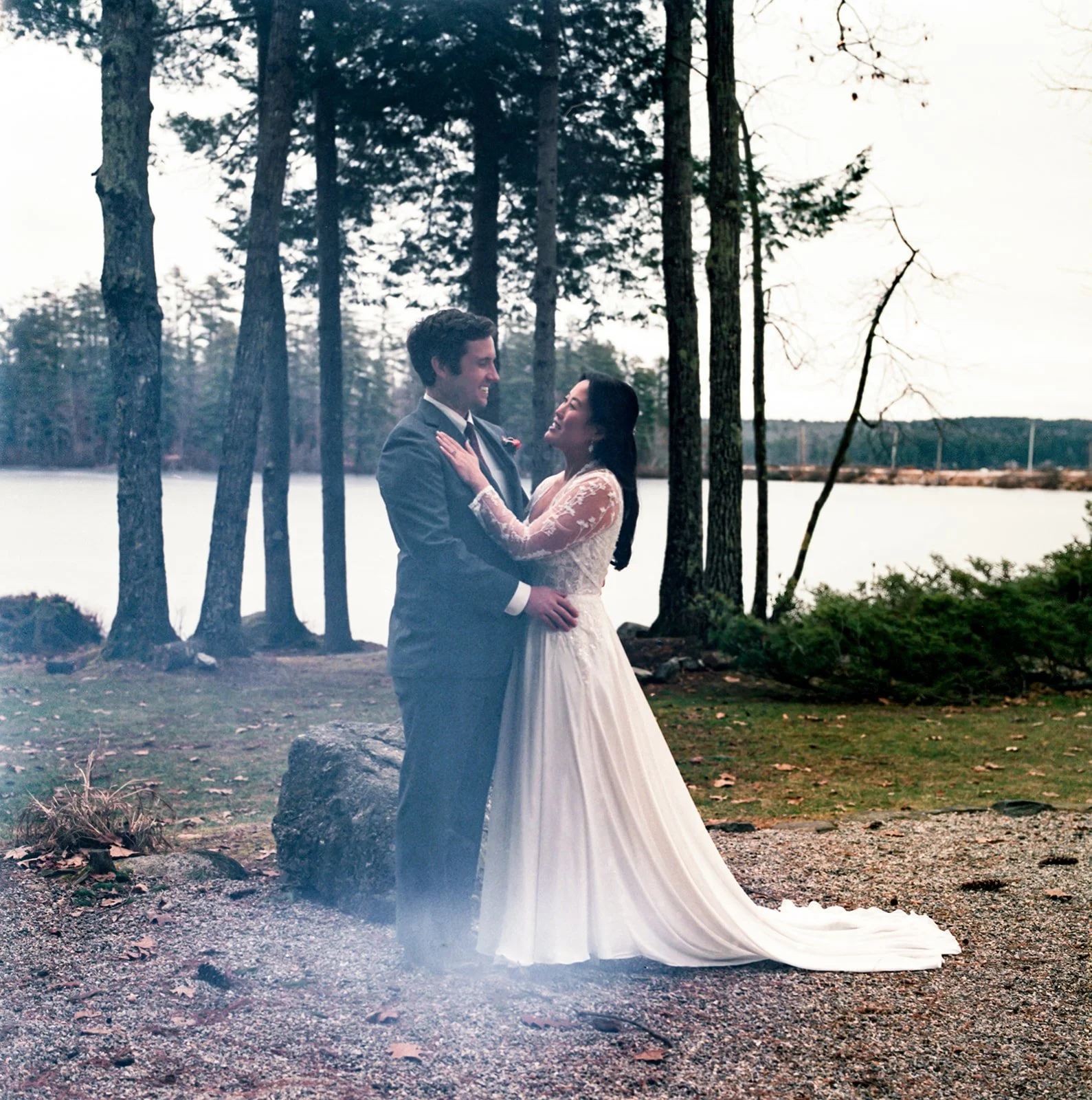
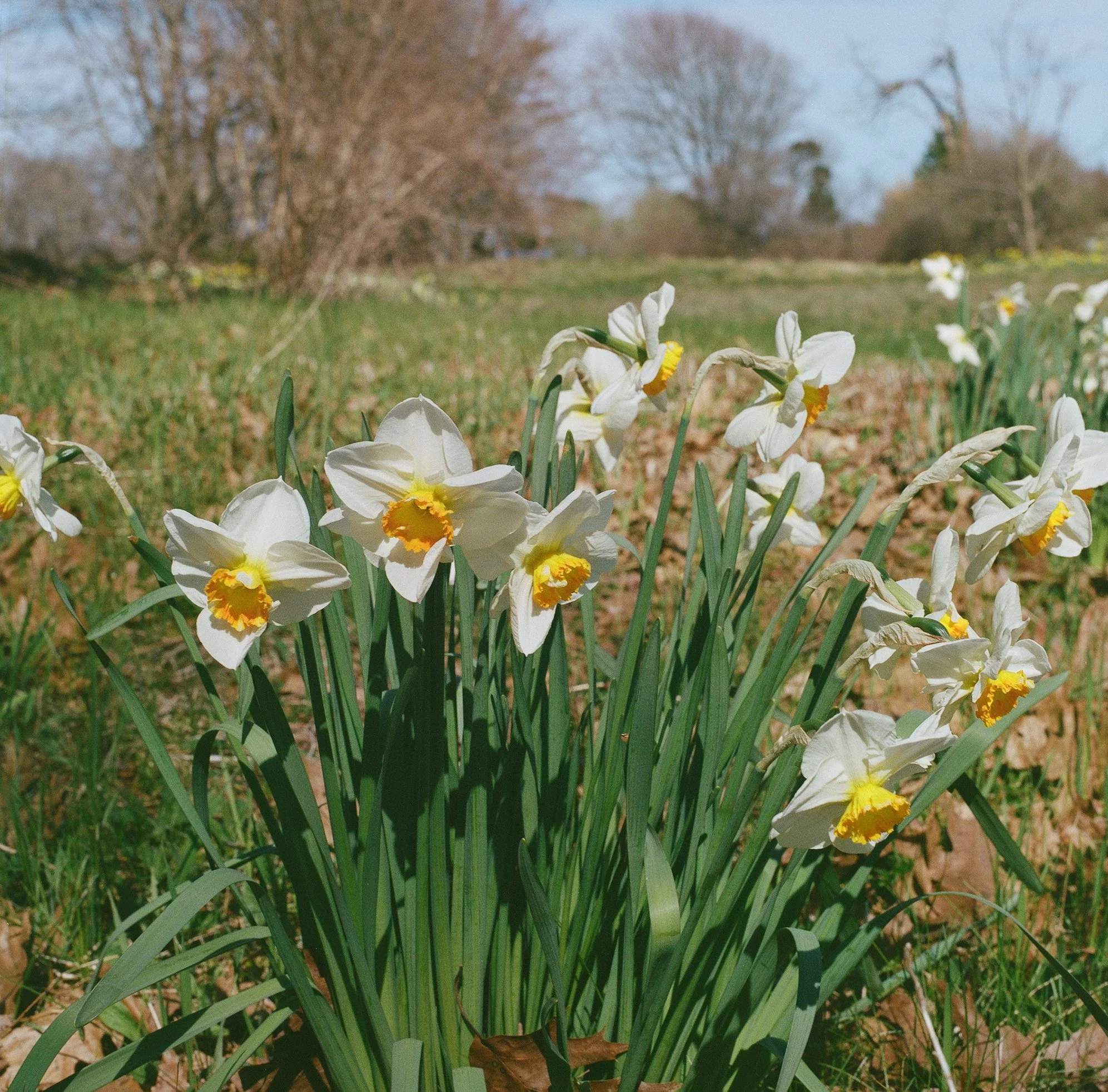
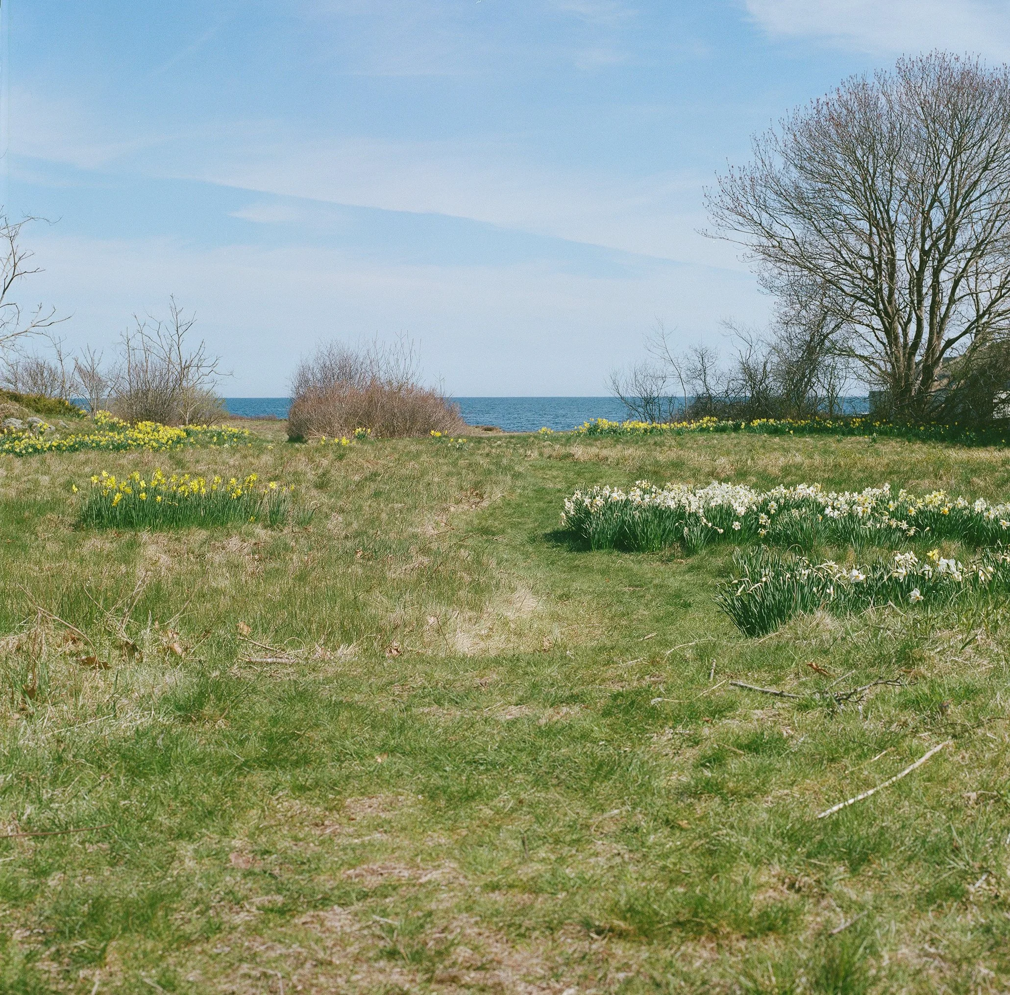
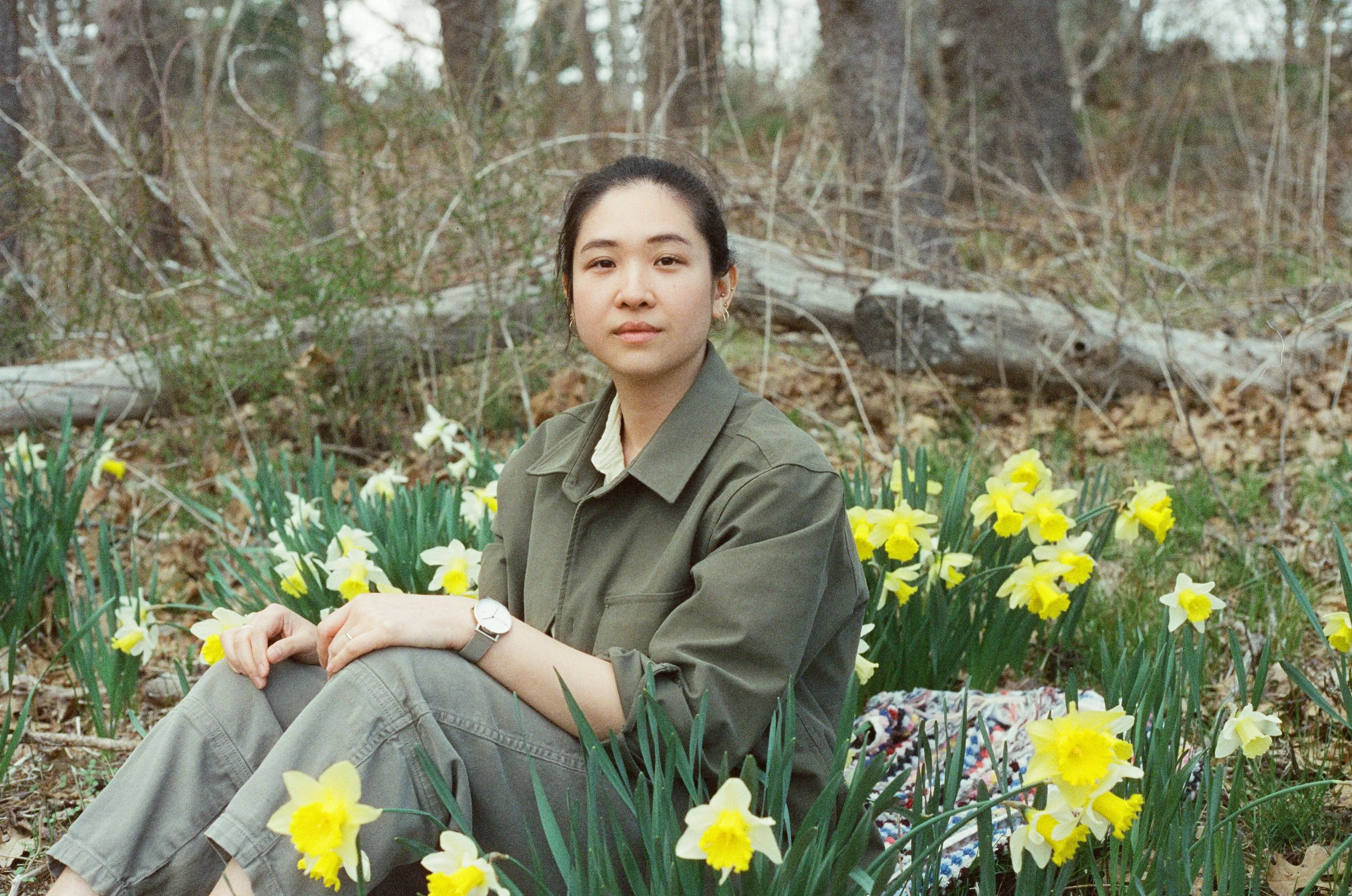
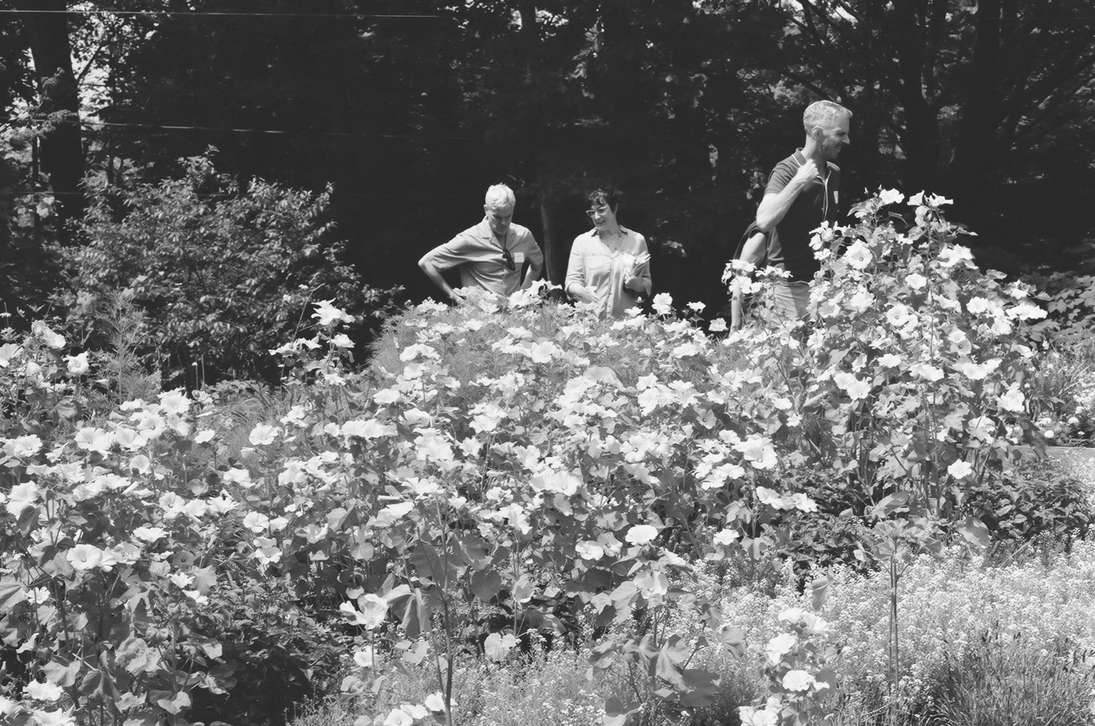
My journey into photography began with film. I was kind of late to the game and by the time I had ever picked up a camera, film was well on its way out. Many films were no longer in production and analog cameras were becoming hard to find. It seemed frivolous to even partake in such an endeavor.
Film is a finite resource; 36 exposures per roll seems ridiculous compared to the endless versatility of digital. More than one person on multiple occasions have told me that it is foolish to use film in a world that has nearly abandoned it entirely. All I can say is that love can do that to a person.
Film is a revelation; a secret waiting to be told. Film is a time capsule that can bring you back to a particular place or moment that you perhaps forgot had even existed. Film is one of my love stories, as crazy as it sounds.
My first film camera was a Diana F+, shooting 120 with no idea what I was doing and every time I got a roll back from processing, with even half of my exposures intact, it felt like a victory. Persistence paid off though. Through nearly obsessive research, wonderful teachers, and the very, very patient people at Nelson Camera in San Diego, I got my film feet under me and never looked back.
I’m not an expert, and even though I have been working as a photographer for over nine years, I feel hardly professional. Despite that I am still obsessed with film. Why do different films do what they do? How does the expiration and deterioration of film and its chemicals change the final exposure? How do the different sensitivities, chemical compositions, and manufacturing processes change the final images that are exposed? The more I learn, the more I want to continue learning. With each new and different film that I try, I am compelled to try them all.
So, I’ve decided to dedicate one little page on my website to film stock reviews. Hopefully, those of you that are landing on this page will find it useful and will discover where to purchase these films online so you can try them out for yourself. If you’d like to see even more of my film photography you can do so HERE.
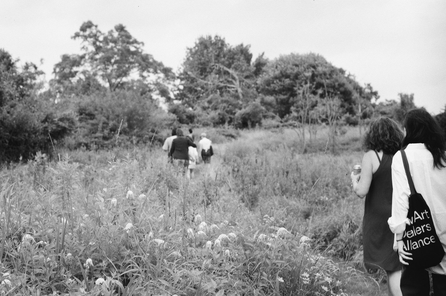
Harman Phoenix II 200 ISO 35mm film with a Canon F1
So, if you look in my last post: “Ilford Ilfocolor 400 plus ‘Vintage Tone’” you will find that I had come to an impasse trying to untangle the web of production and supplier in the family of Ilford, Harman, and Kentmere films. There was much confusion, and my life simply does not allow for these kinds of lengthy ponderings. However, I wanted to give you an update, and review a new film, and because I am a very lucky duck, I get to do both in one post.
Towards the end of last summer, I saw an event pop up at my local camera store, Hunts, a photo walk using a brand new film stock being released by Harman. So, naturally I signed up, because of course I had to. Each participant was given a roll of brand new Harman Phoenix II, the second generation color film released by Harman. The first was Harman Phoenix, which was high contrast, very grainy, and had vibrant oranges and greens.
Harman Phoenix II does a great job with its greens, blues,oranges, and reds. It has very high contrast and a noticeable grain. Skin tones, while some were a bit on the orange side, were really lovely as well. I really loved how glowy the highlights are on this roll of film, it reminds me a little bit of the orthochromatic and infrared films I’ve tried.
One of the biggest things about the Harman Phoenix photo walk that I participated in was that I got to talk to a representative from the Harman company and ask about the production of the film. It was the best kind of photo walk, a perfect evening, surrounded by other film enthusiasts, and I got to ask the nerdiest questions to someone who actually knew the answers. Ok, so here is what I understand now after learning a bit about the company. Ilford, Harman, and Kentmere are all owned by the same umbrella company - Harman Technology, Ltd. Ilford has a long legacy of producing professional quality films, papers, and chemicals and uses specific formulations that are time tested and were developed to create high quality images and products. Several years ago, prompted by the shift in the color film market, and encouraged by the photography community, they decided to begin the process of r&d to make a new line of color films. The process of creating these formulations, perfecting them, and then producing them is a long one, and the Ilford company wanted to create a different brand identity that would be separate from the legacy of Ilford. So, Harman Phoenix was created. The films are all produced in their factory in England and as far as we know - they are not producing films to be re-rolled by other film companies. So, I got a little bit of clarity on the whole situation and I got to make some fun photos using a film stock that is still very new.
Would I recommend this film? Yes! It was a really fun one. The event that I attended, where I got to test out a roll, was one of many that the Harman company hosted and the resulting images that I’ve seen from these events are stunning.
I would suggest stopping down about half a stop on this roll, to get a little more light on your film as it tends towards being very high contrast. I shot mine at 150 ISO and achieved some really beautiful exposures. I hope that you have lots of fun with this one, it is really unique.
Ilford Ilfocolor 400 Plus “Vintage Tone” 400 ISO 35mm film with a Canon F1
Ilford Ilfocolor 400 Vintagetone 35mm color film is a C-41 color negative film that is formulated to have bold reds and a vintage look. This film is sold by Ilfocolor as in Ilford, and for a minute I was like, is it the same company as Ilford Delta HP5? Isn’t Ilford the same as Harman? And is it also the same company as Kentmere? Then someone was like, “Ilfocolor 400 is the same as Orwo Wolfen NC500, just repackaged.”
Cue my utter confusion.
This post has been waiting as a draft, stalled out while I was trying to figure this out and finally I came to a conclusion after many searches, a lot of wasted time in forums, and a bunch of lost threads. Here’s what I landed on. It is hard to find these answers. This web of brand identity is not one I can fully unravel, I am not a detective.
Ultimately, and I may be alone in this, but I do not care. I don’t. I don’t care if a company has a bunch of subsidiaries and sister companies and they all share a basic corporate identity but do slightly different things. Like, I LOVE learning about the origin and process of film production, but this was a next level of internet sleuthing that I simply do not have the time for. Are you an expert in the long and storied history of the ILford company and its brand identity? Then shoot me a message to help me clear this up, because hours of my life wasted with no real answer is not what I am here for.
What AM I here for? You ask?
Well, the photos of course. It is quite simple, I had never used this film before. So I put it in my camera and took a bunch of pictures and guess what? I LOVE it.
It has a beautiful grain, deep contrasts, and warmth. Greens are lovely with a broad range of colors. Bright pops of yellow and red are dynamic. Skin tones are true and it does feel very retro. Earth tones are rich and there seems to be an amber hue at play throughout the roll but it isn’t overpowering. I took this roll of film with me to the Isabella Stewart Gardner Museum in Boston and it was the perfect place to practice. The Gardner is beautiful with no shortage of incredible backdrops for photos and lots of pockets of light and shadow to play with.
It would be impossible to analyze two film stocks without a shot for shot comparison of them because of all the different factors that are at play, but I am going to share images from a roll of ORWO Wolfen NC500 and this roll of Ilfocolor 400 Vintagetone. If I had to guess I would say that these are NOT the same film stock. Are they both a bit grainy? Yes, but it is different. The Orwo looks a lot fuzzier to me and the Ilfocolor seems like a smaller grain. They are both very contrasty and both have lovely warm peaches and pinks. To my eye the Wolfen NC500 seems brighter and has more turquoise and yellow, where the Ilfocolor is more amber and green. Ilfocolor also seems to have higher color saturation. Are they similar? Yes. Are they the same? I would say no, not at all.
So, while the mystery and conversation happening in the online film community is interesting, to me it shouldn’t overshadow the delight that either of these film stocks bring. Both are fun and yield beautiful results.
Orwo Wolfen NC500 Color Film.
Ilford Ilfocolor Vintage tone 400
Orwo wolfen NC500 Color Film.
Ilford Ilfocolor Vintage tone 400
Orwo wolfen NC500 Color Film.
Ilford Ilfocolor Vintage tone 400
Orwo wolfen NC500 Color Film.
Ilford Ilfocolor Vintage tone 400
FujiFilm Superia 100 ISO 35mm film that expired in 2006 with a Canon F1
Fuji Superia 100 was once just one offering in a whole line of 35mm color films. Manufactured by the Fujifilm company it was a true to life, general use film. It was marketed to point and shoot, everyday photographers because remember, there was a time when phones with cameras were just a dream and everyone who took photos took them on film. As the film market shifted in the early 2000’s the manufacturers reacted to the lessened demand and many film stocks were discontinued, this is what happened to Fuji Superia 100 when it was the first of the Superia line to be discontinued in 2009.
There are still rolls of this particular film stock available to purchase, mine was a gift that came from NH Camera out of Chicago, Illinois, which is currently sold out, but if you keep an eye out, you can still find it and hopefully it will come back in stock someday.
This roll was originally rated at 100 ISO and it expired in 2006. To make it easy on myself and not have to adjust anything while shooting, I set my ISO rating on my meter to 25, that’s two stops less sensitive than what the box rating is, one for each decade since it expired. Then, when you process it, you process it at its box rating, thus overexposing your film.
This is because films’ light sensitive chemicals and dyes deteriorate and become less sensitive with time. It can also be very dependent upon how the film was stored and what kind of conditions it was exposed to in storage. The more light, heat, and moisture it is exposed to, the more likely it is to lose its sensitivity and have color shifts and deterioration. This can be really exciting to be honest, a little experimental and tons of fun, but it can result in loss.
Shooting expired film can be a risk, but one that can lead us to some thrilling surprises. When an expired film stock fails, it can bring about grappling with feelings that are a lot like grieving. I think that practicing loss in the artmaking process can be one of the best places to nurture ourselves through feelings of grief. Losing something you have made when it is fairly low stakes can evoke a lot of feelings that are similar to losing something you care very deeply about, but instead of it being life altering, it is a brief confrontation of loss. You can practice going forward, you can practice losing something without it rippling out into your life, or getting stuck in the labyrinth of grieving. Most importantly, you can try again, which is something you often can’t do in other instances of grieving.
Experimenting with art can help us to learn how to let go of something small, so that those emotions are not quite as alien to us when something big must be let go. Perhaps I am overthinking it, but practicing with expired film, or alternative processes can help cultivate more than the process of photo making.
This roll of film came back from processing with some of the most beautiful exposures that I have yielded from an expired roll. There was a color shift that I noticed most in the darkest parts of the exposures, there was a noticeable green shade that is not true to life. Warm colors turned out beautifully and skin tones were surprisingly close to the real thing. I generally shot this with a wide open aperture - 1.8 on my Canon F1 and most of my shutter speeds were around 1/125 at the fastest, which led to a bit of blurring. For this film I would recommend a bright sunny day or a brilliant golden hour shoot and possibly a tripod to steady your camera for longer exposure times to compensate for that lowered ISO rating. This one was a great practice of letting go and seeing what comes up in the film, so satisfying and fun.
Flic Film Aurora 800 ISO 35mm film with a Canon F1
My first introduction to Flic Film was with a roll of Street Candy ATM 400, a roll of film that had been re-spooled from decommissioned atm cameras. I didn’t know much about the Flic Film company, but as I was looking into Aurora 800, I learned that Flic Film is a company committed to environmentalism as much as it is committed to making films that people love to use. From their website: “The products we produce are influenced by two principles, customer wants and needs and environmental sustainability and responsibility. All products are designed and packaged to have the lowest possible impact on the environment.” I love to see this. Can more film manufacturers step up and commit to being environmentally friendly? I think so.
Aurora 800 is described as: “Aurora 800 is a high-speed film, having a finer grain, higher sharpness and more natural skin tones. This film is very well-suited to photographing moving subjects and working in low-light conditions while maintaining true color reproduction.”
I found this to be a really accurate assessment of this film. My skin tones were very close to reality, the grain was very fine, and my scans came back incredibly sharp. I would also add that my blue skies were brilliant and slightly turquoise, the blue waters of Cape Elizabeth were a brilliant sapphire, and the yellows, oranges, and greens of fall were vivid.
Aurora 800 had a slight yellow-green hue to it, which influenced all of the other colors. The oranges and greens were slightly reminiscent of the persimmon and lime color palettes of the 1970s and gave these photos a very vintage feel.
This film was so much fun, and because it’s a little bit faster ISO, it facilitated faster shutter speeds, meaning I could move around more as I shot, which is honestly how I like it. I would describe my shooting style as “always in motion” When I am taking photos, I am literally walking and lunging and squatting, and laying on the ground. I am rarely in the same place for more than the fraction of a second that it takes me to snap the photo. When the person in front of the camera is also a moving target, I move with them, if someone is low to the ground, I get lower. I need to move fast. While I have practiced with long exposures and tripods and slow shutter speeds, and found it to be a meditative practice of making photos, it is incredibly gratifying to be able to shoot fast.
I had so much fun with this film and I think it would make a great choice if you are intentionally shooting something that you want to feel like a 1970’s throwback. It gives a vintage feeling that is honestly very hard to duplicate in post. Overall, I loved what I got using Flic Film Aurora 800, I feel good about supporting a company who is committed to its environmental impact, and would absolutely shoot with it again.
FINDLab x Candido 400 ISO 35mm film with a Canon F1
For about ten years, my mother lived in Ogden, Utah. The few times that I was able to go visit her there I was surprised and impressed by how lovely it was and how there was such an active and vibrant arts scene. She loved taking me all around the region to see what was going on in neighboring towns too. An art fair in Provo, a Buddhist temple in South Ogden, a Musical in Salt Lake City. Over the years I have encountered numerous photographers who reside in Utah and every one of them has been memorable and inspiring. More recently, I have been fortunate to be able to study with two different artists from Utah, Summer Murdock at Illuminate Classes online, and Yan Palmer. Both have been wonderful teachers that helped me grow so much as a photographer. I’m not sure exactly what Utah is doing, but whatever it is, it produces really great photographers.
Several months ago, my teacher Summer had posted a link on her social media to a Kickstarter campaign to help support a photography studio - The FIND lab - that was trying to grow its business and offerings. They wrote in their campaign, “This new creative space will contain a public darkroom, daylight photo studio, art gallery, camera repair, film retail store, and film processing. Everything a photographer could want, analog or digital,”and it really spoke to me. It may be thousands of miles away, but I want good things for artists who love the same things I love, no matter where they are. So I donated, and they held up their end of the deal by sending me a roll of film.
The film is a collaboration between the people at FIND lab Utah, and Candido Collective who are producing a small line of color films, a 200 ISO color film, a 400 ISO color film, and an 800 ISO film. Their website gives few details about the origins of the film or who is the manufacturer, but does say that the films they sell are the result of trying many different films from different manufacturers until they found the results that they wanted.
This film was shot at the end of a beautiful summer. It contained family photos at Cape Elizabeth, Maine. Artists at a residency on the Maine Coast. An old friend who came to visit us from Los Angeles after not seeing each other for over a decade, and the joy of baby goats in a pasture.
The first thing that I really noticed with these images is the red and green. Reds are vibrant and really pop, greens are rich and nuanced, and earth tones are warm. I also really like the contrasty deep blacks that I got with this particular film. Moody shadows, without the photo feeling out of balance.
Vibrant colors? Check.
A li’l bit of drama in the contrasts? Yep.
Supporting a small, artist run business? Double yes.
Beautiful, satisfying photos on film? Absolutely.
I hope that someday I’ll be out west again, perhaps I’ll get to stop by and see the FindLab Studio in person.
If you are interested in buying this particular film, you can do so HERE. But don’t wait, it's a limited edition.
Cinestill BWXX at ISO 800 black and white film with a Canon F1
I rarely push film. I know this is something that some photographers swear by but it’s not something I practice much. I credit this hesitancy to an incident in a black and white photography class where a roll of film that I knew had beautiful captures on it accidentally was pushed to what I later estimated to be four stops. It was an honest error but I was so sad about the resulting overexposed images that I was like nope, this is not for me.
Pushing and pulling film can be really useful though, some photographers prefer the results with certain film stocks being pushed a stop or two because of the changes in grain, contrast, and color saturation/shift that pushing can produce. If you are like, “whoa, whoa, whoa, Kerry what are you even talking about?” then I would recommend reading up a bit on pushing and pulling film. There are some beautiful results when done skillfully and deliberately and more importantly pushing your film can have some very practical applications as well, like if you are shooting in low light situations, or you want to shoot at higher shutter speeds, or have a longer depth of field.
Sometimes on a variable speed film I won’t know what the “best” speed to rate my meter would be, so I just pick one and go with it. For this roll of Cinestill BWXX I chose to rate my meter for 800 ISO knowing that it could both result in very grainy and high contrast photos. I am ok with both of these things, so I went for it. Rating for a higher ISO also made it possible to shoot at faster shutter speeds, which resulted in some great freeze frame shots with no blur, which can sometimes be challenging shooting on an old camera with no flash.
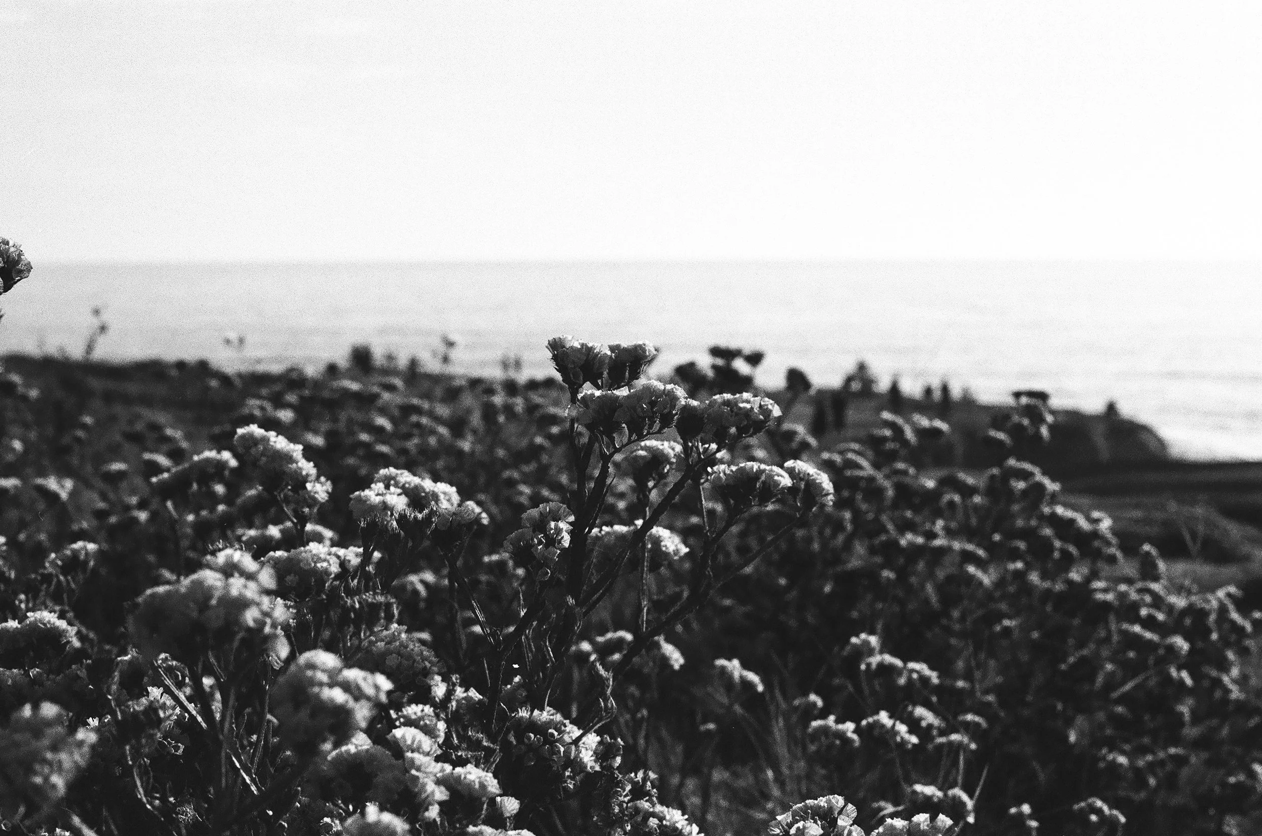
I love how this roll of film came out, I spent an afternoon and evening walking around Mission Hills, Point Loma, and Sunset Cliffs in San Diego. It had been over a decade since I had actually taken in a sunset at Sunset Cliffs and it did not disappoint. Here are some of my favorite shots from a roll of Cinestill BWXX variable speed black and white, 35mm film. Shot on a Canon F1 with a 50mm 1.8 lens.
Interested in being shot on Cinestill BWxx? Interested in getting on my wait list for my next San Diego visit? EMAIL ME!
Reflx Lab 400 ISO Daylight 35mm color negative film with a Canon F1
A few years ago, the cost of color 35mm film went way, way up. A result of the ongoing pandemic which led to slowing in production lines, supply chain disruptions, and labor shortages. Pair that with a renewed interest in 35mm film by movie production companies, whose film needs were put as a priority by the manufacturers, who in turn, were filling orders of color 35mm film much slower. The selection of finding a roll of even the most commonplace color films was a challenge and when you did happen to locate one, the resale price was astounding. I saw some for $35/roll and I was like “Welp, that’s a no for me, folks.” During this time period, I started to look around to see if there were any other color film stocks out in the world, perhaps ones I had never heard of.
After a bit of exploring I found Reflx Labs. A company out of Shenzhen China that takes reels of 35mm movie film, removes the rem-jet layer and re-packages and rolls them for use in 35mm film cameras. I loved the sample images that I saw on their social media and website so I decided to give them a try. I tried to buy directly from Reflx Labs online but couldn’t because my bank flagged the transaction because of their international location. Luckily, I was able to order from Legacy Photo Lab in Dallas, Texas.
I was really curious about what movies had been made using this same film stock and I was happy to see titles such as “The Lord of the Rings 1: The Fellowship of the Ring,” “Inception,” “”Django Unchained,” “Star Wars Episode VIII: The Last Jedi” “Killers of the Flower Moon,” “Oppenheimer,” and so many more. This was really exciting for me, to play with films that are usually reserved for movie production definitely feels special.
I rated this film at 400 which is the box rating recommended by Reflx Labs. I was a little hesitant to do this though because I thought that Kodak 5207 was rated at 250 ISO. However, the exposures that I made turned out beautifully. I am not sure why there is an ISO difference if it is the same film stock, perhaps the film has a bit of exposure latitude, or maybe there is something in the process of removing the rem-jet layer that affects the ISO, either way, this roll of film turned out beautifully at the box speed of ISO 400.
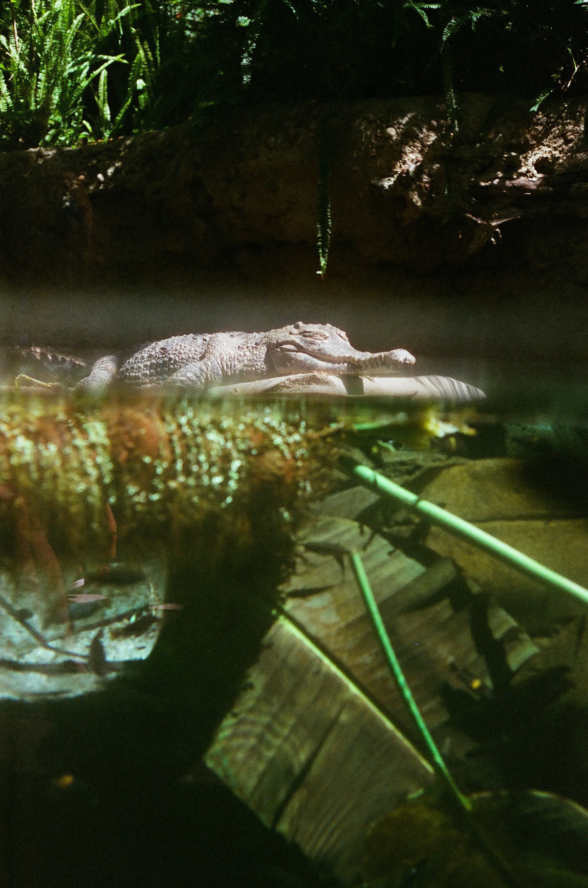
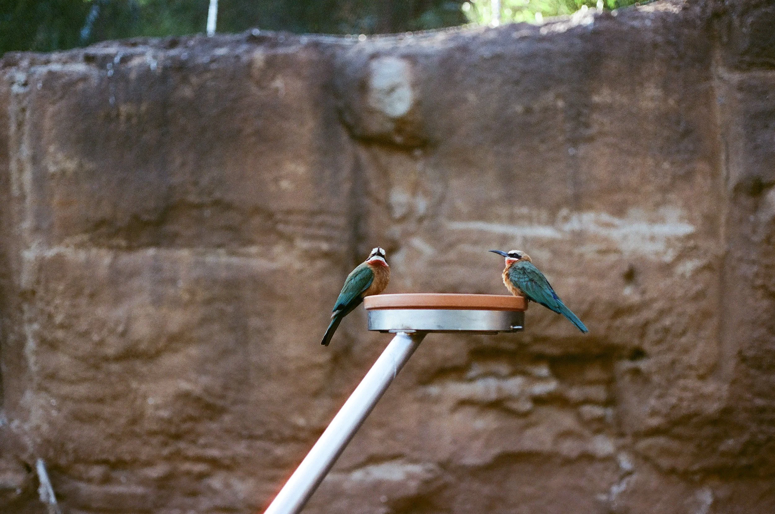
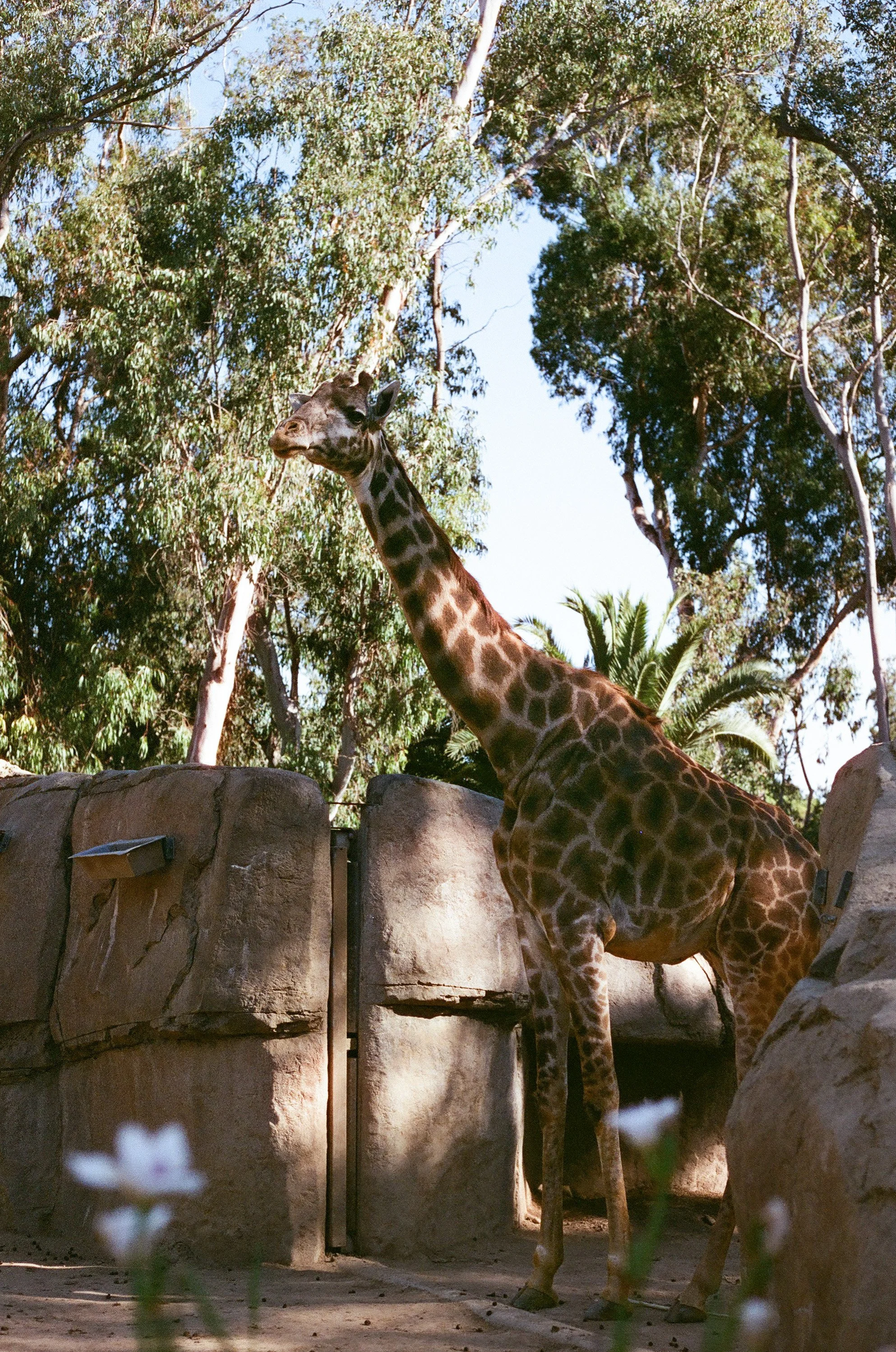
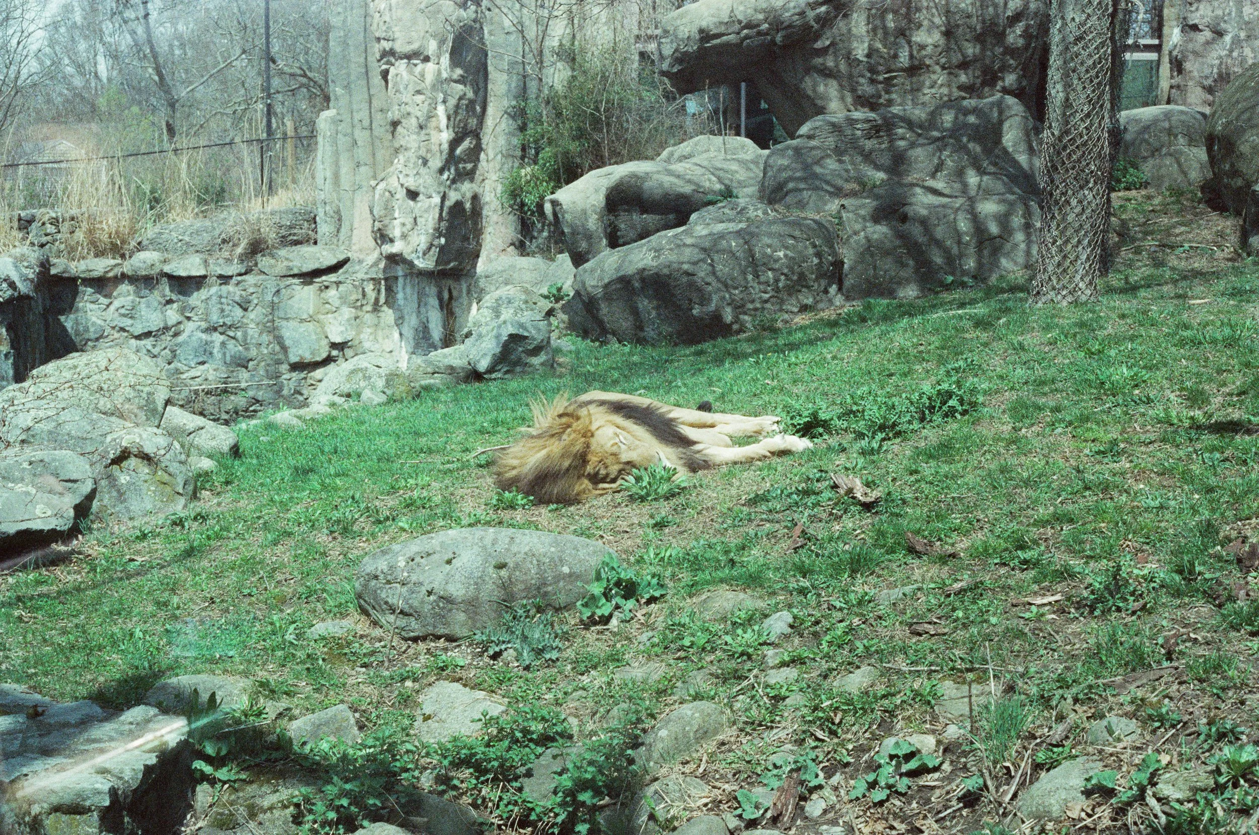
I especially love the wide range of true to life colors that I got on these photos. I took a trip to San Diego and brought my Canon F1, loaded with a roll of Reflx Labs 400D on a trip to the San Diego Zoo and I am so happy I did. Here are a few photos from this beautiful roll.
Kono! Original Moonstruck Variable ISO 35mm color film with a Canon F1
I have no idea how this roll of Kono Moonstruck variable ISO 35mm film came into my lineup. Perhaps it was a gift - my friends and family are never stumped on what to get me for Christmas and birthdays - I will always be excited about getting film. I possibly picked it up somewhere, intrigued by the packaging? I don’t remember when I acquired it or where I got it from and for that I’m sorry. Since I knew very little about it before shooting, I went to the Kono Website to read up.
I learned that this company was founded in 2014 in Austria. Kono’s founders had spent years working in analog film manufacturing, research, and development prior to striking out on their own. They began to create a line of films that pay homage to classic film stocks as well as films that are brand new and fun to use. Now, located in Germany they offer an extensive line of films that all look really fun and inspiring in both color and black and white, as well as a selection of special effect films.
I’m really impressed with the Kono company’s commitment to sustainability as well. I have always felt there is a lot of waste in the photography industry. I appreciate the efforts of Kono to reuse film canisters and reduce the amount of trash that film manufacturers and processors produce. That definitely makes me want to support their company even more, especially after seeing what this particular film stock produced.
The first thing that came to mind when I saw my scans from this roll of Kono Moonstruck 35 was how warm they felt. There is definitely an overall pale yellow tint to many of these images but it is, in my opinion, a really lovely addition to the overall color palette that the film has. It reminds me just a bit of very old photos in newspapers, but with far more clarity and dynamics. The colors in these images also have a softness that is nearly in the realm of pastels, yet the saturated greens and blues balance out the muted colors. I also love the rich contrasts, deep blacks, dark blues, and greens that I achieved. The reds really pop though. Everything red is so vibrant, it is really exciting to see a film that has nice, full, nuanced reds. The grain is quite visible but I don’t find it distracting at all. Overall, I was really happy with my photo scans.
These photos feel like summer, which is why it seems so serendipitous that I chose to shoot this particular film stock at the beginning of what has been so far a beautiful season. I took Kono Moonstruck with me around town with my family, on a few shoots, and to a beautiful artmaking event on the coast of York, Maine. Here are a few favorites from this lovely roll of Kono Moonstruck variable ISO 35mm film, photographed using a Canon F1 camera.
Kodak Portra 400 ISO color 120 film with a Hasselblad 500c
Portra 400 has long been known as one of the most popular color negative films on the market. Its clarity of color and exposure latitude have established it as a favorite for film photographers working in weddings, fashion, and portraiture since 1989 when it was first released by the Eastman Kodak Company. The overall color palette that Portra 400 is famous for is warm, with subtle pastels, rich jewel tones, and smooth skin tones. I love bringing Portra 400 when I’m working with families and at weddings because it gives me consistent, beautiful results. For the last few months I have been getting comfortable using a medium format camera: A Hasselblad 500c that was most likely manufactured in 1955. I made a little video about how to load film into a Hasselblad 500c for those of you who may be interested, here’s a companion video to this review.
The Hasselblad 500c is one of the most iconic cameras in photography history. When I acquired mine, it was used, and while it had obviously taken many, many photos, it was clearly very well cared for. Despite that, it was still a nearly 70 year old camera, so after initially having some inconsistent results, I had my camera professionally tuned, cleaned, and calibrated by Andy at Classic Camera in Saco, Maine. You can see in the image below the bit of cloudiness, don’t worry I still took tons of photos at this wedding on my other cameras that weren’t cloudy.
After Andy gave it a full fix-up I took it back out for more photos and found that the results were stunning. The reputation of Hasselblad cameras precedes it and this one did not disappoint. For a vintage camera, this one has made some of my most satisfying images on film. Paired with Portra 400 120 film I was absolutely thrilled when my image scans came back from processing. Using a Hasselblad is a slow process, which requires also using a light meter to get a proper exposure. I use the pocket light meter app on my phone, which has been delightfully accurate.
One of the things that continues to excite me about using film is how intentional the act of photo making is when working in these formats. This is emphasized even more so when using a Hasselblad and shooting medium format which only produces 12 exposures. Every choice matters and when I slow down, look carefully enough, and tune into all of my senses to really see how the light is working in a scene, I am stunned with the images that are created with this antique treasure.
I am finally feeling ready to offer photos taken on my Hasselblad to my clients. You can add on 120 film by the roll to your family session or wedding and have your photos taken on a piece of photography history. Go here to book your session!
Cinestill 800t 800 ISO color 35mm film with a Canon F1
Cinestill film began in 2012, right around the time when film manufacturers had downsized dramatically and many photographers found themselves looking to the motion picture industry to source color 35mm film. The people at Cinestill spent countless hours working through the process of converting motion picture film to still photography film, figuring out the process of removing a rem-jet layer from the large reels of film in order to re-roll and package it for still cameras.
Rem-jet is a protective coating that prevents film from being damaged, I can imagine this would be useful when film reels are being edited and transported, but when a film roll with rem-jet is put through a standard photo developer machine and processed with c-41 chemistry, the rem-jet layer contaminates the chemicals in the machine, leading to hours of flushing, cleaning, and re-calibrating of said machine. Not to mention the damage that could be done to other rolls of film that share the same chemistry. From their website:
“...we knew we had to make the film compatible with any still photography lab in the world. Our task was to take this amazing film stock designed for ECN-2 motion picture processing, and invent a treatment to refashion it to be safe for standard C-41 still photography processing.”
So, after extensive experimenting, the task of removing the rem-jet layer was achieved. Then, taking the process of film manufacture another step further, Cinestill began making their own film, based on the same formula of the original cinema reels, but without rem-jet from the get go, simplifying the manufacturing even more and eliminating the risk of contaminating commercial developing machines entirely.
The images that I made using Cinestill 800t are some of my recent favorites. The first thing that I noticed when reviewing my scans were the incredibly vivid greens and blues. In a few images the green felt slightly overexaggerated, perhaps just a little more punched up than I expected. I was really happy with the rich earthy browns and reds and true skin tones that I achieved. The bright yellows were a hint more neon than reality, but the vibrance is welcome after a long, monochromatic winter.
These photos have a muted softness to them and I am instantly reminded of movies from the 80s and 90s. When I scrolled through these photos it reminded me of hours spent as a tiny child, loading and reloading my father’s slide viewer, looking through the eyepiece, and scrolling through the slides over and over.
If there is any overall color shift, it is a hint of green. While my brain knows and understands that these photos are from film, my eye doesn’t always register the grain, it is almost imperceptible. The clarity of the images and the vibrance of the colors are what I love the most about this one.
Knowing what I know now about Cinestill 800t, I can see this being an excellent choice if you intentionally want to feature bright and vibrant colors, especially greens and blues.I would also grab this one when making portraits, especially in nature. Overall, I am really happy with Cinestill 800t and will definitely pick up some more.
Interested in getting on my books for photos made on film? Click here.
Wolfen NC500 400 ISO color 35mm film with a Canon F1
It is frequent that I pick up new films with little to no information about them prior to loading them into my camera. Here’s the pitch the salesperson at the camera shop gave me regarding Wolfen NC500: “We don’t have very much color film, but we have this, we got it in stock yesterday and it’s almost sold out. I’m not sure what the deal is but people have been coming in non-stop to buy it today.”
“Sure, why not, I’ll try anything once.” Which is a great attitude to have when trying out new film, but one of the riskier philosophies when it comes to life in general. For a long time it felt like using film for photography was something I had to approach with great care. Film stocks get discontinued all the time and what if I ruin something that I can never find again? Many who know me will attest to the fact that I am no perfectionist, but I absolutely hate wasting film. The prospect of wasting a good roll of film on terrible photos or destroying it all together is one I try to never do if I can help it.
In May 2022 Orwo, a 116 year old German Film company, released Wolfen 500NC a 400 ISO 35mm color film. From the Orwo website, “At the core of our new colour film lies a unique chemical formula based on the wonderful and legendary Agfa stock last used in the Oscar winning film ‘Out of Africa’. Famous for their greens, desaturated shadows and enhanced grains…”
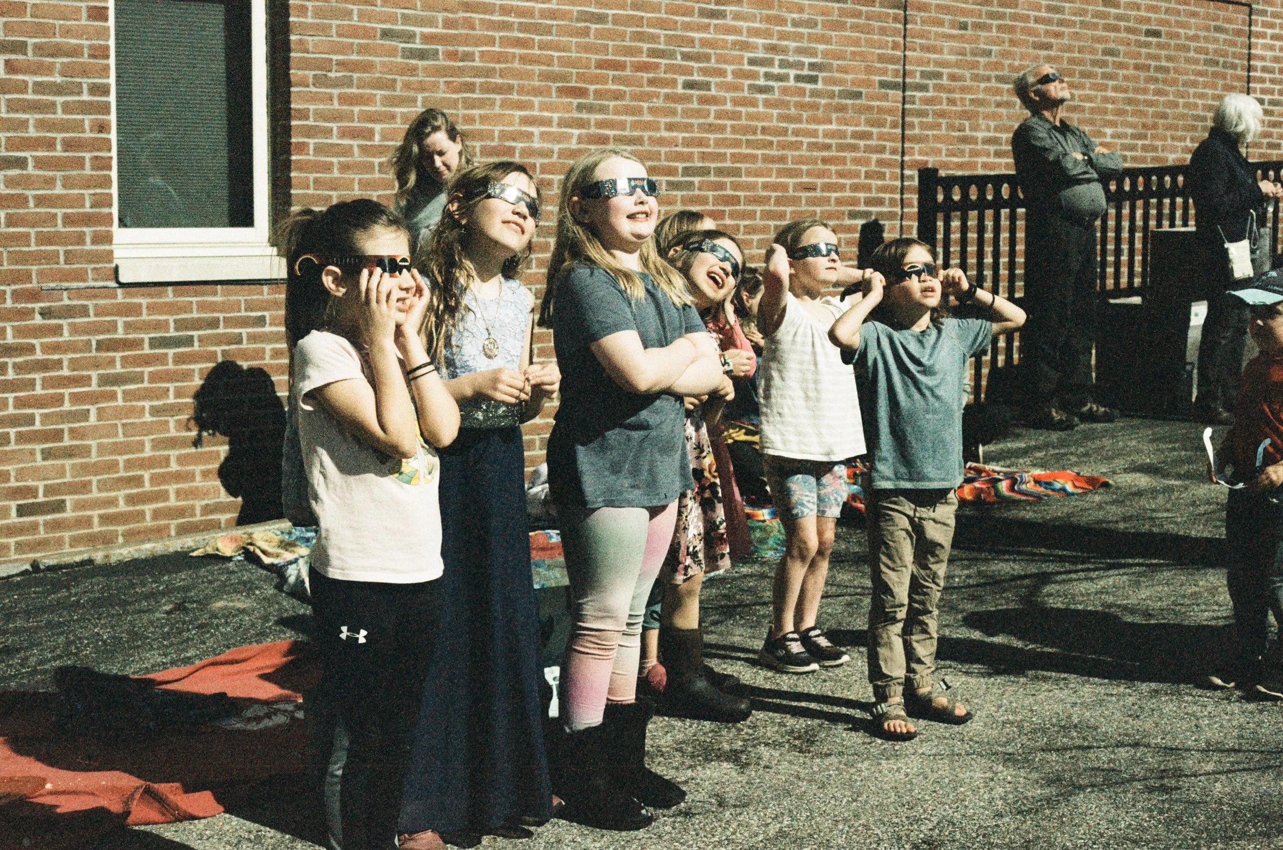
I took my time with this roll of film, shooting mostly in bright daylight, but I did take it with me to the eclipse viewing party at my local library, so the light was weird and intense. We were at the 96th percentile of totality which made for quite an experience. While I didn’t have the requisite filters and lenses on my old Canon F-1 to attempt a shot of the eclipse that day, I was able to get photos of the other viewers from my sweet little town and these are some photos that I will treasure forever.
When I got my scans back I actually went, “Ooooooh!” because yes, the greens were complex and lush but also, the pinky peaches, warm goldy oranges, and rich browns were a real dream. Perhaps it is the velvety quality of the grain with Wolfen NC500 but these images trick my brain into thinking they were taken 40 years ago and I think that is the real magic here.
So now I know exactly why people were rushing the film counter at Hunt’s Photo, this film is definitely one to put in your camera. Interested in getting on my books for photos made on film? Click here.
HARMAN PHOENIX 200 ISO color 35mm film with a Canon F1
Recently, a brand new color film was released by HARMAN, the company that has been producing Ilford Delta 400 - a favorite of mine - for years. Manufactured at the Mobberly, UK factory where photographic papers, chemicals, and films under the names of ILFORD, and KENTMERE are also produced, this film marks a new venture for HARMAN and the name Phoenix represents a rebirth for the company. Read all about it here.
I was excited to try out this film because when it was released, the test shots that I saw were absolutely stunning. I am so glad I got my hands on a roll and gave it a go. The results that I got did not disappoint. The three words that most summarize these images are “vibrant,” “dreamy,” and “contrast.” Reds, yellows, and greens are punched up with hues of bottle green and coral, the little slice of a bright blue sky or a blue winter coat were vibrant and rich. This film accentuated the sunbeams that fell on a sleeping jaguar, taking its nap in a sunny spot at the zoo, giving the light a warm peachy glow without skewing the natural colors of its fur. The flamingos’ pink color showed up bright coral, the earthy peach of a fresh layer of birch bark is given just a hint of life from an otherwise wintery white color palette.
The aspects of this film that are both the most surprising and delightful to me, however, are its deep contrasts. I love a contrasty roll of film and I’m used to achieving that when I shoot black and white, but this color film gave me contrast and drama and all the mystery that I love so much. I love finding spots of light and shadow and the inky blacks that this film produced are rich and satisfying.
Overall, I will be revisiting this film again, because it was so much fun and gave such beautiful results. I would definitely use HARMAN Phoenix 200 on a bright day with blue-skies, enjoying the last rays of sun at golden hour, or at an event that’s full of color.
Rollei Superpan 200 ISO black and white 35mm film with a Canon F1
Recently I went into my local camera shop looking for black and white films I hadn’t used before. It was recommended to me to give Rollei Superpan 200 a try, because of the rave reviews that it was getting and its similarity in results to infra-red film. From the Rollei analog website:
“High-sensitivity black-and-white negative and slide film, which is ideal for taking pictures of versatile and high-contrast subjects. It is especially powerful in low light conditions. A reliable all-rounder!”
And “...With an extended red range up to 750 nanometers, it can also be used as an infrared film (in combination with an infrared filter).”
There is a world of knowledge to dive into regarding the electromagnetic spectrum, and I’ll post some links here and here to help you understand, but the basics are this:
A spectrum of electro-magnetic radiation is present throughout the universe. On one end of the spectrum we have gamma radiation. Somewhat near the middle of the spectrum is visible light, you know it as the rainbow. Just beyond where red light is visible, is infrared. Beyond infrared is microwave radiation, beyond that are radio waves.
Certain films that were created to be sensitive to infrared radiation and the images taken with these films are really incredible. Often you can shoot these films without an infrared filter and they work perfectly fine as well, but before you do, make sure to do your research. I wouldn’t want you wasting good film and the truth is, if you have a roll of infrared film in your hand, you are probably aware of it, because it’s not that easy to find.
If you do find yourself with some infrared film and you're ready to try it out, the good news is that most manual SLR cameras are capable of infrared photography, you just need the right filter. Which I do not have, yet, so I just used the film as it was, and even without it, got some really great results.
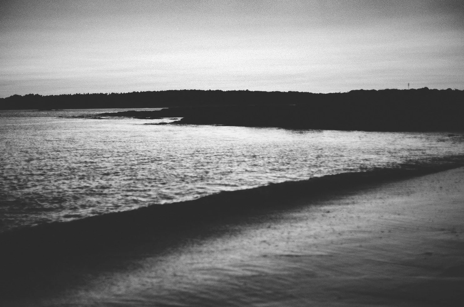
I exposed this particular roll of Rollei Superpan 200 in a few different conditions. Bright midday sun, on an overcast but bright mid-morning, and at dusk at the beach. I am in love with these photos. The particular glowiness, I’m assuming from a slight sensitivity to infra-red radiation, adds such a special quality to these images. Since I wasn’t using a filter or specifically exposing with the intention of infrared photography, I didn’t really know what I was going to get. I metered for the box speed of 200 ISO and used a Canon F-1 with a Canon 50mm1.8. I tend to use wider apertures whenever possible but I didn’t track what aperture and shutter setting I used for each exposure. Here are some of my favorite images made using Rollei Superpan 200 35mm film. I absolutely recommend giving this one a try.
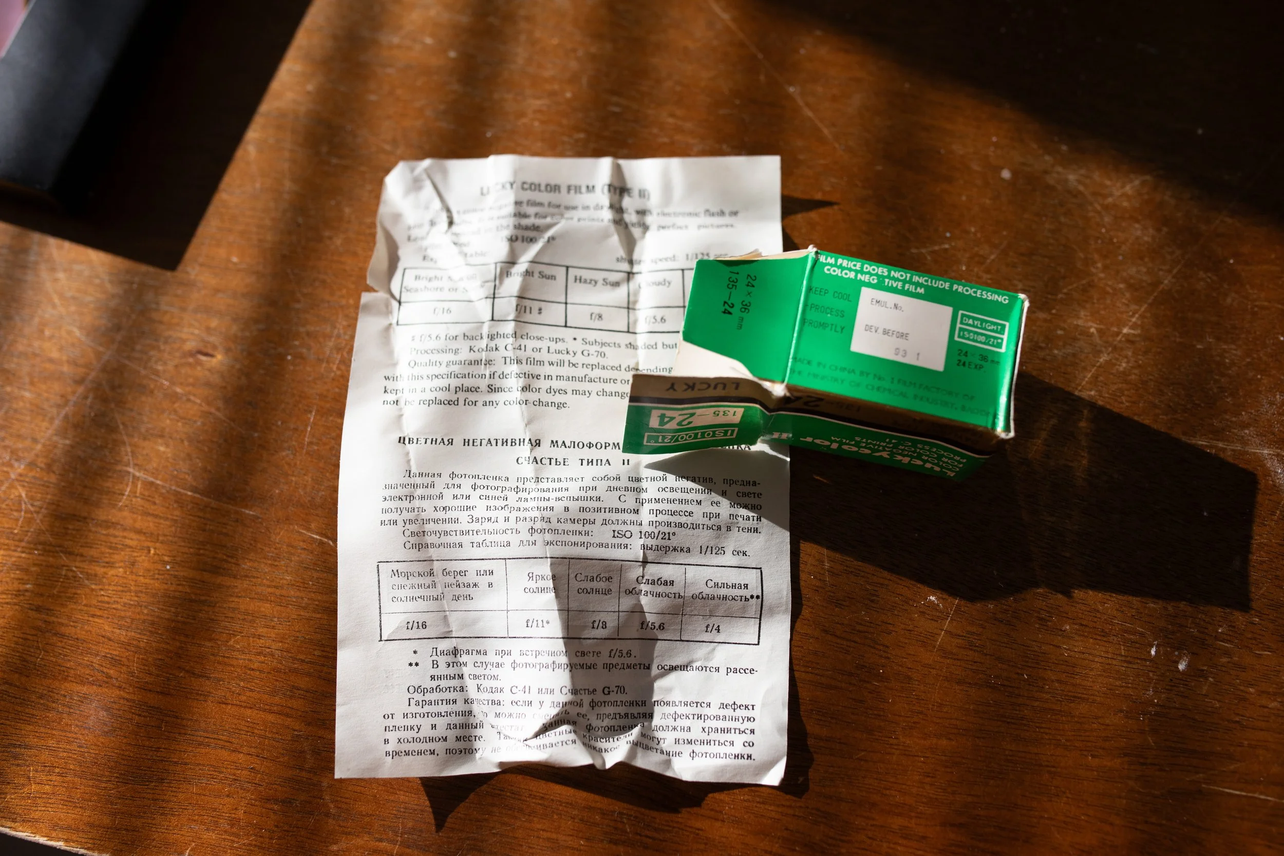
Lucky Color II 100 ISO 35mm color film that had expired in 1993 with a Canon F1
In Gemology, an inclusion is a characteristic enclosed within a gemstone, or reaching its surface from the interior. It is, by all measures, an imperfection. Inclusions, however, are incredibly important. They can tell a trained gemologist, appraiser, or geologist, the origins of the stone. They can lead us down a path of clues as to the chemical makeup, environmental conditions, and geological history that resulted in the stone being made at all. Inclusions can be gasses or other debris caught, quite literally, between a rock and a hard place, forever. Certain inclusions, such as those found in star rubies, actually make the stone more beautiful, creating an array of sparkly rutile that is woven throughout, reflecting light in what is called “asterism.”
I had no expectations for a roll of Lucky Color II 100 ISO film that had expired in 1993. I knew that when it was new, it was a standard, true to life, color film with a slightly slower ISO that was still considered medium speed. Being 30 years expired brought another dimension to this roll of film. It is recommended to stop down one stop for each decade that a film has expired. Since the lowest ISO setting that my camera’s built in meter has is 25, I was left to experiment a little with opening my aperture an extra stop, or slowing down my shutter an additional stop. Even then, the adjustments that I made to the exposure could not account for whatever journey this film has taken between 1993 and now. There is no way to know how it was stored, if it was exposed to something chemical or otherwise that could influence it, or how many times it’s been shipped through an x-ray scanner.
I wasn’t entirely convinced that the photo lab was going to be able to process this one. The film felt almost brittle in my fingers as I loaded it into the camera, its tail end was curled so tight in the shape of the film canister that I had to gently coax it to lay down into the camera. I worried it would just break as they were loading it into the machine, or that it would disintegrate when finally submersed in C-41 chemistry.
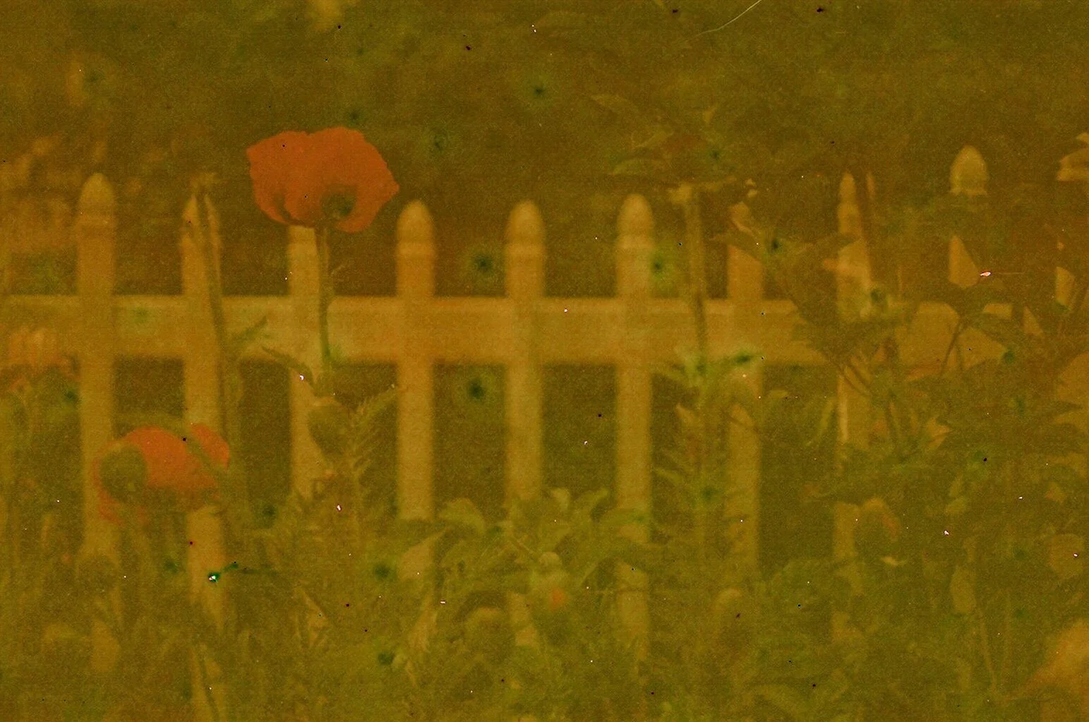
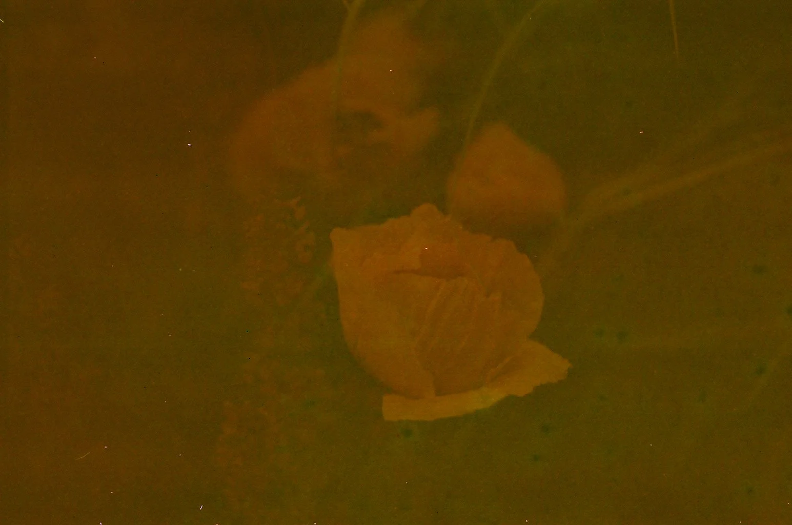
I was so surprised and delighted to see that when my image scans came back to me, that they had actually worked, but there is no denying that the age of the film and its subsequent deterioration have changed the images entirely. They are muddled, very yellow, there is spotting, there are scratches. In full disclosure, these images were edited in Lightroom to clean them up and brighten them, to bring definition and enhance them. Actually, since we are on the subject, ALL of my images are edited. I learned to dodge and burn and create a dynamic print back in the darkroom in San Diego and now, I use Lightroom to finish my images, digital and film. It’s a huge part of my process and I figure I should be honest about it. I kept most of the imperfections though, because to me, they feel more like inclusions than imperfections.
The images don’t look entirely like photos to me, they look like impressions of a photo. They make the moments feel further away. They feel like a memory that you rarely have, almost like a painting, or an old newspaper, yellowed and curling, that shows you a time that you forgot. The spotting and inconsistencies bring a texture that I don’t think I could imagine if I tried. I think that this roll of film was far more of an experiment than others I have worked with. Full of surprises that tell a story.
Kodak Color Plus 200 ISO 35mm color film with a Canon F1
I’ve been wanting to try Kodak Color Plus for the last few years. I kept seeing it go on sale, sell out, and then disappear for months. So I knew that it must have some loyal photographers that would scoop it up whenever it came back in stock. I am always intrigued when a certain film, or piece of equipment seems to have a following, so my interest was piqued. If I’m being completely honest, though, I think it was probably the retro looking packaging that initially drew me in. I am nothing if not predictable and if you want to sell me something, package it in a box that looks like it was pulled from the set of a Wes Anderson movie. Beyond my superficial desires to try ColorPlus 200 there was more though. I kept seeing reviews about it and loved the images that I saw. Bright, saturated colors, warmth, and a sharp grain.
The colors really were nuanced and despite the “matte” feeling of the images, the myriad of tones, shades, and hues were represented beautifully. Certain color films create warm, bright images, but sometimes these same films that are so good at mimicking golden hour light and invoking nostalgia in a viewer, will shift the colors of everything, including things that you don’t want to be changed. Sometimes you want a film that is going to capture the colors as true to life as possible. Kodak Color Plus 200 achieves both warmth as well as a spectrum of colors that is impressive.
I rated my film at box speed - 200 - and shot it using a Canon F1 and a Canon 50mm 1.8 lens. Most of the images I took were on bright sunny days. I love this film and would definitely recommend it for sunny days, bright colors, and beautiful sunset sessions.
Lucky Color 100 ISO 35mm film that expired in 2012 with a Canon F1
I had no expectations for Lucky Color 100. I had never heard of it before and through some research found that the Lucky Film Company was originally founded in 1958 in Baoding, China. They produced a variety of color and black and white films that were widely distributed across Asia as well as other digital imaging products, medical, and laboratory equipment. In 2012, after a series of mergers and company restructures with both Kodak and China Aerospace Science and Technology Corporation, compounded with the rapidly declining film market, they announced that they would no longer be producing color film.
For Christmas, I was given a roll of Lucky Color 100 speed 35mm film that had expired in 2012. Despite my love of film and my quest to try as many different types and speeds and varieties as possible, I rarely use expired film. I guess that even when it’s in the spirit of experimentation, I’m still attached to making images that at least turn out ok, and I’ve been afraid that expired film won’t produce any results, let alone satisfying ones.
In preparing, I did a bit of internet sleuthing and found that one piece of advice that seemed to be consistent across platforms was that when shooting expired films, for color negative film, rate it one stop slower for every decade since it expired, assuming you don’t know the storage conditions. There are other techniques you can test out as well; I encourage anyone shooting expired film to give bracketing, or pushing your film a try, but keep your expectations realistic. As films age past their expiration dates, they lose sensitivity and the dyes and pigments used in their emulsions can change. I shot this film in a really low stakes situation, hiking at Two Lights State Park, a place that we will surely return to, on a clear bright day. Keeping in mind that if the film itself has lost sensitivity, I would need lots of light to get a good exposure.
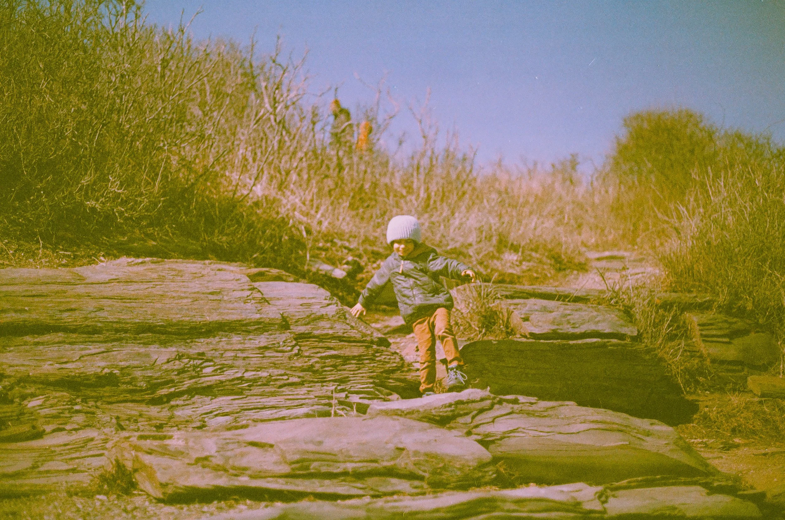
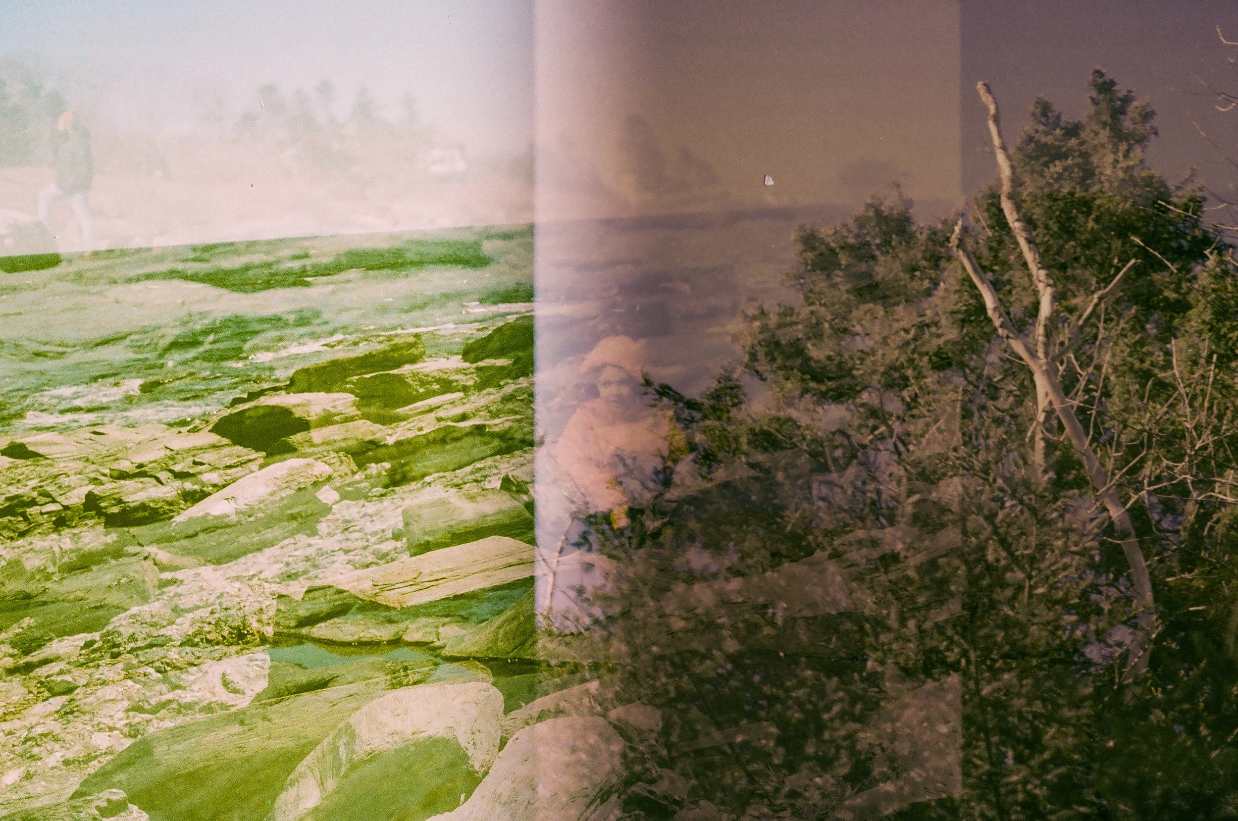
I intentionally double exposed some of these, just to play around, and I am so glad I did. It was fun to let go and experiment. I think my favorite result with this roll is the wild neon color shift. The coastal brush and trees at the park and lining the trails had not quite burst into bloom and everything that was naturally earthy and brown got an extra bright yellow hue. The interior lining of my son’s jacket in real life is neon yellow and this film shifted it to bright rusty orange. Skin tones were left fairly neutral but are high contrast.
REFLX LAB 800T 800 ISO 35mm color film with a Canon F1
Reflx Lab was formed in early 2022 in Shenzhen China buy two analog photography enthusiasts who wanted to create a line of films stocks and photography equipment that aimed to “quench the global thirst for cinematic film.” Early in 2022, color film stocks were in a global shortage, and prices were rising dramatically from resellers - $24 a roll for portra400 anyone? I had scoured their website for more information, and then looked at their social media links, to see the kinds of images that were being made with the film. I was intrigued by the colors and the way that artificial lights glowed in the images that I saw. I had to try it.
I wasn’t able to purchase Reflx Labs 35mm film directly from them, because my bank immediately flagged the purchase as fraud, perhaps because of the location of the sale. So I checked the stockist list on their website. I purchased Reflx Labs 800T 35mm film from Legacy Photo Lab in Fort Worth, Texas.
Some info from Reflx Labs about this particular film stock: “Made from fresh 5219 motion picture film, Rem-Jet layer removed, Tungsten balanced film, ideally for indoor or night scape shooting with a distinctive, futuristic halation effect.”
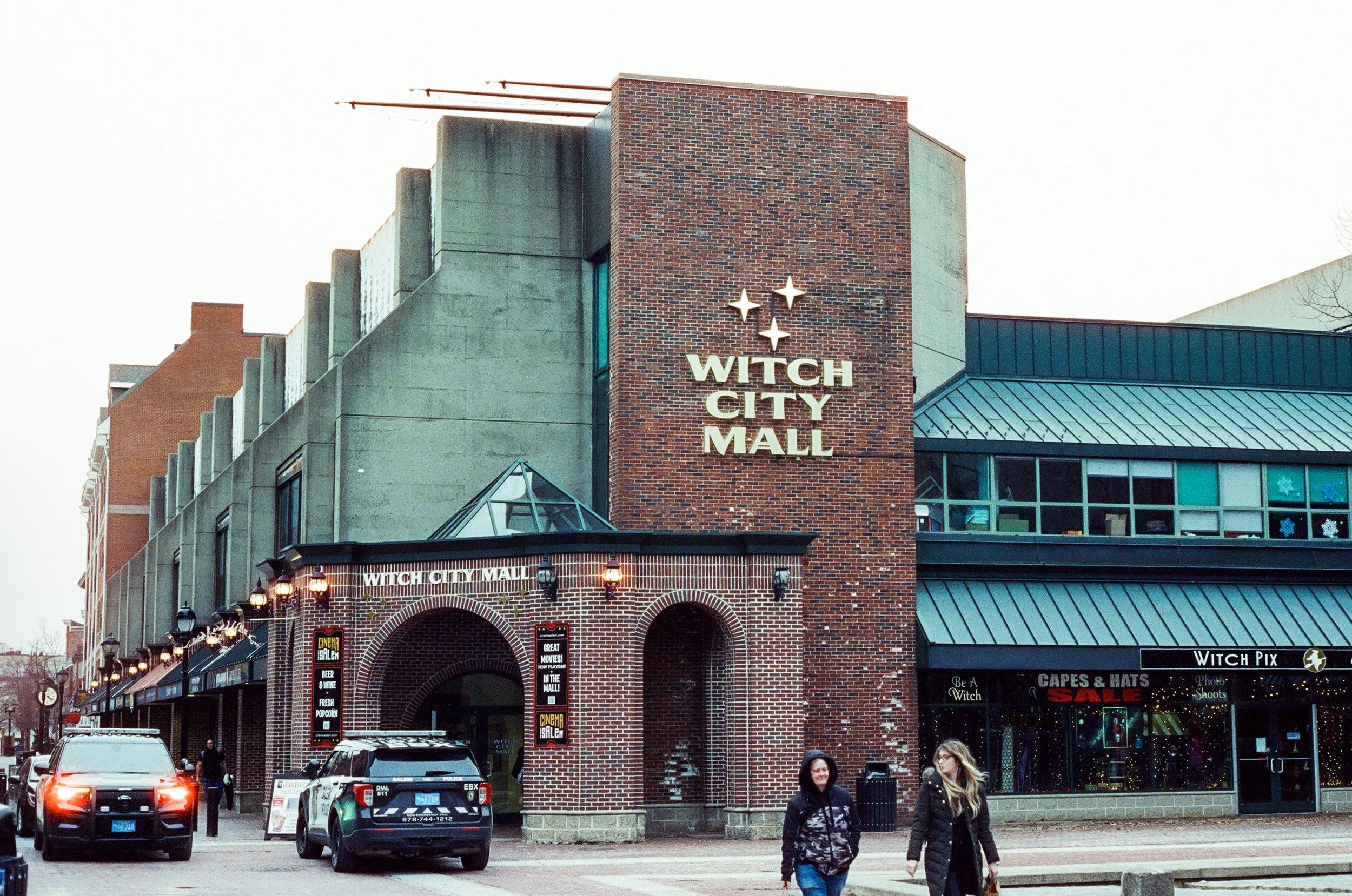
When I received my image scans back, I was immediately struck by the color saturations. Beautiful blues and greens, with a warmth to skin tones and vibrant pops of neon pinks and yellows. The blacks and shadows in these images were particularly deep and saturated. I love the grain that showed up when I took a few images under fluorescent lights of the Peabody Essex Museum in Salem, Massachusetts. The blue of a Konstantin Dimopoulos “Blue Trees” installation photographed so brilliantly I was really thrilled. As promised, there was a glowy halation anytime I photographed light sources, the headlights of oncoming traffic showed up with a particularly intense glow.
This film has a very distinct aesthetic, the saturations of greens and blues are so lovely and the grain, while being quite distinct, is not distracting. At first glance I thought, “how glossy” these images look. When I went back to take another look with grain in mind, I noticed it was actually quite pronounced. One interesting thing I noticed was that in images that were made entirely using LED stage lights, even though my light meter was reading as a balanced exposure, they look incredibly grainy, especially in red light.
Overall this was a really fun roll of film. I would love to try again with this particular film stock and plan a shoot in a location with some bright light sources in the frame and use wardrobe choices that are gem-tones, and richly saturated colors.
Santa 1000 ISO 35mm black and white film with a Canon F1
For years the origins of Santa 1000 film were kept secret. The people at the Finnish Santa Film company were purchasing bulk rolls of 1000 ISO black and white surveillance film, re-rolling it, and packaging it for retail sale. Re-rolling deadstock film is not a new practice, some of my favorite images have been made on deadstock films that have been re-spooled and packaged, like Super Low ISO and Retrochrome 400. The origin of this particular film, though, was the Russian Government. It was an interesting backstory to the film, but that changed on February 24th, 2022, when Russia, unprovoked, invaded Ukraine, a peaceful and sovereign nation.
The people at Santa Films had an instant conflict of interest, the film that they sold so successfully had origins that raised an ethical concern.
“Because we are from Finland, we understand what a war is like where hundreds of thousands of men with thousands of tanks are commanded to rush at you from the east. We also know how deep and long the recovery for the people of Ukraine will be as our families still have scars 80 years after our war.”
So, they decided to discontinue the production of this particular film stock. All the remaining film that they had on hand was sold with the proceeds going to fund aid organizations supporting the people of Ukraine. You can read all about it here. I was offered a roll of this film by a photographer named Zoe Wittering, who purchased a large number of rolls and sent them all over the world,supporting both the fundraising effort and facilitating artists to make images using this film.
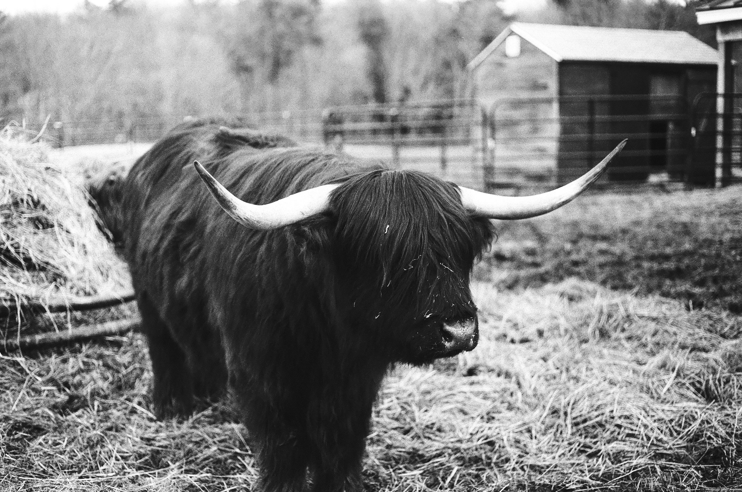
I felt an obligation to not waste this film, to make images that felt grounded and peaceful. The horrors that we have all been witness to these last 8 months have left me often feeling helpless and small and the very least I can do is to be thoughtful in my artmaking. I made a trip out to a local farm on a cool morning in the early spring, ready with my roll of Santa 1000 loaded in my Canon F1. There I met a fold of Highland Cattle, I photographed them, powerful, huge, soft, gentle.
This film is very delicate, so thin that the counter in my camera didn’t register it, and due to hand spooling, you couldn’t tell if it was actually advancing or not. So, I had no idea if I was actually taking photos, or if the film was just floating idly in my camera as I repeatedly clicked the shutter button and turned the film advance. Every single time wondering if there was something wrong with me, or my camera, or if I had made some sort of mistake in loading it. I had to slow way down, so, so slow, and breathe a lot. I decided to just keep going with it, even though I couldn’t tell if anything was actually being exposed. Luckily, it was exposed, and the images turned out beautifully. The film itself, once processed, had to be delicately scanned because of how thin it is. It has rich contrasts and picks up on the texture of the fur and straw. The grain of this film makes it almost look like a painting. And the darkest grays and blacks are very deep. It was a little bit tricky to work with, since I couldn’t tell if it was advancing or being exposed. So, while I felt a little lost while using this roll of film, the results were so satisfying. If you get the chance to try a roll of Santa 1000, expect that you may not be able to tell if the film is advancing, but as long as you slow down when loading it, you most likely will get some really beautiful results.
If you are interested in purchasing a print of an image made with Santa 1000, you can do so here, all profits from the sale of these images will be donated to UNICEF, to help fund aid to children who are living through the ongoing war in Ukraine.
Fomapan 400 ISO 35mm black and white film with a Canon F1
It may or may not be news to you, but there is currently a color film shortage. The causes are complicated; reduction of production capacities, supply chain problems due to the long present pandemic, and the renewed popularity of film are a few reasons. I am sure there are others, but those are the causes I keep running into. So, the last few months, I’ve been rationing off my last rolls of Portra 400, and exploring more with black and white film stocks.
Recently I took images on a roll of Fomapan 400. I had never heard of this film stock before but I was intrigued enough by its packaging, and it was less than $10 a roll, which lately seems like a deal. According to Foma, a Czech company who has been producing film paper and films for over a hundred years:
“panchromatically sensitized, black and white negative film of the speed ISO 400/27°. This film features a good resolution and it is intended for use under unfavorable light conditions. The film is available in roll film 120, perforated 35 mm films including long length rolls.”
I made images on this film with my Canon F1 over the course of a week or so just going out and about. Some of these are from a brisk afternoon walk through the Old Port in Portland, Maine. I had a few child-free hours and took myself around taking street photos. Others are from a visit to an art fair in the Village of Gorham, Maine. Some are from early mornings with my dog and visits to friends' houses. I am absolutely delighted with the results of my roll of Fomapan 400. Sometimes I’ll snap a shot in less well lit areas just because I’m hopeful that they will turn out and with this film I was thrilled to see that most of my least likely images made it. The fish market in the Old Port was dark inside and I thought I’d try just to see if I could get anything out of it, and surprisingly it turned out. There is a slightly fuzzy grain with rich contrasts that don’t disappoint. Skin tones are velvety and I also really like how this film picked up the delicate textures and details of different surfaces and environments. Overall, this film is a great black and white that will give you clean images with lovely contrast. I’m considering using it as a black and white option in my 35mm workshop series for both it’s price point and it’s beautiful results. So, while you’re patiently waiting for your Ektachrome to come back in stock, Fomapan 400 is a great film to try when you want to add some black and white to your portfolio.
Lomography Potsdam Kino 100 ISO 35mm film with a Canon F1
I was recently talking with a friend who was like, “but why do film photos make me feel different than digital?” I was like, “gimme a minute…”
The simple answer is that they bring about a feeling of nostalgia.
I think there’s more than just nostalgia, there is science. Color science, technology, and psychology were all present in the process of creating films. The choices that the chemists and colorists made when creating film stocks were deliberate. Some colors feel different than others.
There were decades spent and empires built for most of the late 20th century coming up with new chemistry, dyes, colors, contrasts, sensitivities, and grain of films that would get produced in the thousands and sent out to camera shops and one hour photos all over the world. With the rapid shift to digital, those r+d departments largely shuttered, taking their treasure trove of information with them.
Lomography is a company that has spent the last 40 years swimming upstream against the current of this technological shift. Some of my earliest forays into film photography were with Lomography cameras and film. My first medium format camera that was gifted to me by my then boyfriend, now husband, was a Diana F+. A toy medium format camera with a plastic lens that has taken some of my very favorite photos.
I like to return to Lomography films when I’m feeling adventurous because they are a company that has been leading the charge in creating new film stock and breathing fresh life back into the product development and innovation of film for a while now. They are playful and inspired in the color ways that they create and they often make film stocks that achieve results that mimic film stocks that have long been retired.
Potsdam 100 is a film created by Lomography “Inspired by the New German Cinema sweeping through Berlin in the 1960s, Potsdam Kino Film casts an unmistakable monochrome charm.” The first thing I notice from my images with potsdam is that the contrast is really nice and balanced. The images, while possessing a broad range of grayscale, somehow feel warm to my eye. The grain is a little bit fuzzy, but not too distracting, and my focal points and details are crisp. Skin tones are smooth and textures are dynamic.
I made photos with Potsdam 100 over the course of a few weeks this past spring. Most of my photos are from being out on walks in Portland, Maine. Some of my favorites, though, are from the Maine Maple Sunday celebration at Merrifield Farm. Maine Maple Sunday is one of my very favorite traditions and I love the images that I made that day. People watching giant cauldrons of syrup boil, oxen, people taking wagon rides. It was so special.
I would recommend using this film when you have a bright day, or a tripod. 100 ISO is a little bit slower film speed, having a good light source, a sunny day to work with, or a tripod to steady your camera, so that you don’t risk having to use too slow a shutter speed and end up either underexposed, or with too much blur. I would be hesitant to use this in a camera that has no shutter speed or aperture control, like the one that I use in my 35mm Workshop. Overall, I was really pleased with the results from this film. I would definitely use it on an outdoor shoot on a sunny day, or a picnic at the park.
Kodak Portra 400 ISO 35mm film with two cameras, Canon F1 and Kodak M35
Few films have a following the way the Kodak Portra 400 has. Warm, forgiving, with a soft grain that, when exposed properly, shows up velvety. The colors that Portra highlights well are warm ones; reds, ambers, earthy browns, mossy greens, and turquoise. Skin tones are true and highlights can sometimes appear just a touch golden. It mimics that golden hour light that photographers are hung up on. For good reason though, it’s forgiving; it paints the sky with warmth and can make even the coldest winter days look glowy and bright. It evokes the kind of nostalgia that hearkens back to long summer days, lemonade stands, and playing until the streetlights turn on.
I have recently tested out Portra 400 with two different cameras, one is a Canon F1, a vintage treasure that was lovingly cared for and gifted to me last year. Trying out old cameras is a favorite hobby of mine, but every once in a while I try one and it immediately becomes my new favorite camera. That is the F1, it’s a beautiful machine, the images are so clean, and it’s easy and fun to use. The second camera is a newer one. The Kodak M35. The Kodak M35 is a very affordable plastic camera. An improvement from the disposable cameras of the late 90’s, but still incredibly simple in its design. It has only one setting, you can turn the flash on, or keep it off. I would recommend keeping the flash turned off for the most part, especially when using a film that is rated 400 or higher, unless you are in low light, or indoors. The aperture is set at f10 and the shutter speed is 1/120th of a second.
In both cameras - the F1 where I have complete control of the exposure, and the M35 where I have very little control of the exposure - Portra 400 turned out beautiful, vibrant images with gorgeous color saturation and an extremely fine grain. Overall, I would say that this may be one of my very favorite films that I’ve ever used. It’s hard sometimes when I find a favorite, because I want to keep using that one film stock rather than try new things. Going forward, I will return to Portra 400 often, especially when photographing families. It’s firmly seated in my Top 5.
Film Photography Project Low ISO color negative 35mm film with a Pentax K1000
I had a roll of Film Photography Project Low ISO color film sitting on my desk for months after I received it as part of the Tandem Double Exposure Coffee Club. I was scared to use it. I read about it on the FPP website. This film was used for motion picture duplication in machines that used lasers. The intensity of the light required a very low ISO of 1.6. Most films that I have used range in ISO of between 100 and 400. The films that I tend to use the most are 400. Using a film with a sensitivity of 1.6 really changed how I shot. For this roll I had to be very deliberate, using a tripod was a must, as the shutter speed had to be slowed way down. Handheld exposures would have definitely ended up either underexposed or blurry, and I wanted to try to get the best exposure I could. Film like this one, which is a re-rolled film, is generally a limited stock. Once it’s gone, it’s usually gone for good. I feel a weird responsibility not to waste these types of films. So I was exceptionally careful and had a bit of anxiety going into the whole thing. The light meter on my camera only rates for ISO as low as 20, so I opted to use a light meter app on my phone, which has proven reliable in the past. Most of my exposures were shot at f2 and there was a range of shutter speeds between 1 second and 1/15th of a second depending on where the clouds were in the sky.
After I made a game plan for how I was going to take these photos, I had to figure out where I was going to take these photos. It was the end of summer and I found my way to Washington Street in Portland, Maine and walked up to Fort Sumner Park and then over to East End School Garden. The flowers there were still in full bloom. It’s hard to put into words, but I feel places very deeply, and sometimes different plants, especially trees and flowers, evoke a feeling that can feel like expressive communication. Sometimes when I interact with nature, it’s as if there is a slowing down of time. Then, if I attune myself to the space that I am in, I feel very connected to the plants around me. It sounds crazy, yes, but I was a latch-key kid who ate cheerios and watched Bob Ross after school every damn day of my childhood, so it really isn’t that crazy. I definitely talked to the dahlias in the community garden that day, they were bursting with joy, and I felt compelled to at least thank them for being so beautiful. The wind was picking up as a storm was moving in from the sea and I had to be very patient and wait for it to die down before clicking my shutter.
This particular film is nice in that it doesn’t need any special processing, just regular color C-41 processing. I love this film. The colors, when exposed in my good old Pentax are so vivid, I actually gasped when I saw these images for the first time. This film requires patience and planning but it is so worth it. Overall, if you have a handle on your manual settings and want to play with vibrant color, I really recommend this one. It’s great if you want to slow down a bit and get some beautiful photos.
Ilford Delta HP5 400 ISO black and white 35mm film with a Canon F1
If I’m being honest, I’ve been a little scared to write this review. Ilford Delta is one of the most widely used black and white films out there. It is forgiving, has a beautiful grain, and deep contrasts. It has been written about so many times I didn’t want to add to the noise by writing another film stock review about the film that nearly every photography 101 student has used.
Instead, I would just like to write a love letter to Ilford Delta HP5: I never really thought photography would be anything to me. Honestly, I wasn’t expecting much from it. It was simply a hobby I picked up when I was healing from a pretty awful dance injury- 2 torn calves, the left, then the right. It didn’t look like dance was ever going to happen again, at least not in the serious sense*, and I was sad, so sad, like terribly, terribly sad.
For years after I would bring a camera with me when I was out on walks, going on trips, going to the park, just for fun. I loved film photography despite the industry pretty nearly abandoning it at that time. I would try whatever film seemed interesting, sometimes my photos would turn out, sometimes not so much. I didn’t try too hard and I didn’t care too much and every exposure that came back with any kind of clear image in it felt like a victory.
I kept shooting though, and little by little my rolls of film got better and better. I started getting books on photography, watching documentaries about photographers. I was insatiable. Finally, six years after playing around with my Diana F+ for the first time I took a photography class. Intro to Black and White photography at San Diego City College. I had been out of school for 11 years at this point, and it was hard. My instructor, Carlos Richardson, was notoriously tough on his students. He was particular, fastidious, and impossible to impress. He was also one of the only teachers I can remember, in any class I’ve ever taken, in any subject ever, in all of college or anything after, who encouraged me. I mean, not just in photography. I mean anything. He told me that I should continue photography, and that there was work out there if I wanted to do it. I wanted to do it. I still do. There are only a few spaces in my life where I feel a sense of purpose: My family and photography. I thought that at some point the feeling would fade, but it hasn’t. I hope it never does.
Our class started with 25 people and by the end of the session there were 5 of us. I would spend hours in the darkroom. I labored over my prints, not because I had to, but because I loved it. I shot roll after roll, hundreds of images. All on Ilford Delta HP5. The only film we were allowed to use for the class. I shot with it so much that even though my viewfinder is definitely just a window to a colorful world, I started seeing my shots in black and white. When I went out without my camera, everywhere I went, I would see the light and shadows as if it were on HP5. So, I stopped going out without my camera. It still happens, years later, even when I know I have a roll of color film in my camera. I look through the viewfinder and see everything in black and white.
When the semester ended I stepped away from the classroom. As much as I wanted to continue I needed to take a break, I was 4 months pregnant when I joyfully got my B+. The hardest B+ I ever earned. I have often wished that I could have continued on, to get more information, to complete the program at City College. I have made the most of the information that I did get though. I have found ways to continue learning and I keep doing so, because there is always more to learn, I will never be done.
In the years since that class I have returned to HP5 when I want to make photos that are balanced, rich, and have a broad grayscale with a fine grain. I know what to expect when I wind that roll into my camera. It feels like going home.
*I did in fact dance again, dear reader, quite seriously for another 10 years, and I still dance, but now, just for me, in my kitchen, with my kids.
Kodak Professional, Pro Image 100 ISO color negative film with a Pentax K1000
Every time I get a roll of film back from processing it feels a little bit like Christmas. I love it, that little burst of excitement opening the envelope and seeing your contact sheet and then viewing a file of scanned negatives, it’s such a thrill.
Using film can sometimes be a big surprise, you may get your film back and it’s not what you remember. Occasionally films capture colors that you remember differently in your mind's eye. This can be caused by a number of different factors. The color and quality of light that you are shooting in is a big one. The dyes and pigments used in the film itself is another huge factor. Some films are going to tend to have a warmer or cooler color palette, sometimes the reds or greens really pop. I’ve used films that have an intentional color shift meant to mimic old infrared films (I’ll review that one later) and there are films that just have brilliant color saturation. Once you find a film that has the color saturation and aesthetics that you like, you can intentionally choose it for the right purpose. I know this seems really obvious, yes Kerry, get to know films and then make them a part of your aesthetic choice, on purpose. There are just so many films to learn, hence why I even started this project.
I recently got back a roll of Kodak Professional, Pro Image 100. It’s a 100 ISO speed film so generally it’s going to need bright light, or slightly longer exposure times to get a good exposure. I feel that 100 is still in the realm of “medium” speed films though, I’m still not quite brave enough to try my hand at the roll of ISO 1.6 that I’ve had sitting on the shelf for over a year, but it’s going to happen here soon, I promise. Back to Pro Image 100, though.
This film captures both primary and secondary colors vividly. I don’t remember the reds and blues of the Palace Playland in Old Orchard Beach being so vibrant, but the photos I took that day have brilliant pops of both. I also loved the balance of grain in this film. I find that if the grain seems too noticeable it can detract from the quality of the image rather than add to it’s nostalgic aesthetic. It’s just an opinion, but one that I’m standing firmly behind. Pro Image 100 has a slightly noticeable grain that doesn’t overpower the images. Overall, I would recommend this film for anyone to try, but especially if you are hoping to shoot vivid reds, blues, yellows, and greens.
Japan Camera Hunter Street Pan 400 ISO 35mm black and white film with a Pentax K1000
I do not know my neighbors very well. We moved to the suburbs last March, then the world shut down, now it is sort of open again, but I’m still very shut down, still nervous about the pandemic. Nervous that my children will get sick, nervous that they will be socially stunted, nervous that one of us will be asymptomatic and become a disease vector. It feels very lonely, to say the least, considering I see most everyone carrying on with their lives as if nothing has changed. So, despite my feelings that I should meet my neighbors, I haven’t. There is a small child, maybe a toddler, maybe still a baby that has moved into one of the neighboring houses to mine. I’m pretty sure I know which house, but not one hundred percent sure. Our neighborhood has space between houses and sound bounces between the trees and there is often no way to tell where different sounds are coming from.
I just hear them, and by them, I mean him. He is little. His screams light up the night and send an electric pang to the space deep inside my rib cage, not my heart though, just below it. He screams for his mother, or perhaps just because he is not yet sleeping through the night. He screams for what feels like hours, but is probably really only minutes. It keeps me awake sometimes and other times it wakes me in the earliest morning hours . I want to open my kitchen door and yell, “Do you need any help?! Does he need someone to rock him?!” and wait for a reply. But I don’t do that. I wonder sometimes if my neighbors felt this way when I had small babies who would cry in the night. Were there women out there in the early morning hours, kept awake by my babies’ cries? Did they feel an uncontrollable urge to help? Did they wake suddenly and look out the window to make sure the baby was ok?
It is like a switch was flipped inside of me that can never be turned off. I hear a crying baby and I immediately respond.
Sometimes when I am woken up in the middle of the night, it takes me a bit of time to calm myself back into rest. Sometimes I find myself browsing online used camera websites and learning about different film cameras until I fall back to sleep. I know that literally every sleep scientist in the world would advise against this. It’s not the healthiest behavior but it works for me. It is far better than doom scrolling and much more rewarding than doing a deep dive into the vapid monotony of tik-tok.
In these past few months I have become familiar with Japan Camera Hunter and his beautiful collection of second hand cameras. The kind of cameras I will probably never afford to buy, but I dream about. The local camera shop recently had rolls of Japan Camera Hunter Street Pan 400 film, so I thought that I would try it. A film formulated to the specifications of the JCH it boasts, “Contrasty and full of character, this is a fantastically versatile panchromatic film perfect for the lovers of monochrome.” I agree on some points. This film did create some incredible contrasty shots. I would describe the aesthetic I achieved as cinematic and the contrast reminds me of old newspaper images from my childhood. I struggled with the exposure settings though. When I got my scans back I was like, what the fuck was I doing? This is out of the ordinary for me, to have a roll so inconsistently exposed. It could be a combination of user error and possibly something went wrong in processing. Honestly, I don’t know.
There is also a lot of information on their site dedicated to rating and pushing the film in processing to achieve the correct exposure. It is worth noting that this film is a variable ISO rating depending on the type of developer used. So, if you want to try this film, read up on pushing and pulling and check their specific product info!
Overall, I’m thankful for this happy accident filled roll of JCH Street Pan 400. I actually really love my final images, their dark contrasts and shadows make me feel like I’m looking through time.
Sometimes it feels like the world is screaming out with the same kind of helplessness that I hear from my neighbors’ new baby at 3 am, over rooftops and through my window. It is overwhelming, just how much sorrow and anger there is. I know this post has run long but I can’t close without saying that I believe that we are all going to need to undertake the work of healing and that healing comes in many ways. Sometimes it enters through the side door, quietly. Sometimes it’s the simple act of being present for a person while they let you take their photo. Sometimes it is as easy as just letting yourself feel something when you want to just turn all the feelings off. The world feels terrible and scary and heartbreaking lately and if we are to get through it, we are going to need to be there for each other, in community, whatever community that may be for you.
Here are a few of my favorites from this roll of film. I hope you enjoy them.
Kodak Tri-X 400 ISO 35mm black and white film with a Pentax K1000
There are certain films whose reputation precedes them. I often run into photographers who have strong loyalties towards one film or another. Over and over again, I encounter photographers who only shoot Kodak Tri-X 400 Black and white film. Kodak began producing Tri-X 400 around 1940, and it entered main stream production of 35mm and 120 film in 1954, but around 2007 it was reformulated to use less silver and have a finer grain. Used as an industry work horse for photojournalists for years, it established its place as a consistent, high quality film that produces crisp, beautiful images, with a wide range of grayscale. Tri-X 400 is so consistent, that it is often the film that photographers will use to practice alternative development processes. You can develop it with instant coffee, or beer, and yield excellent results. The chemistry of these processes is not that out of left field, but I’ve honestly been too nervous to try on my own. I have always been a bit anxious in the developing lab and careful to the point of paralyzing rigidity. Developing film has always felt like a specific process and I don’t want to lose my photos. I’m getting braver though and considering being adventurous and trying beer or coffee development some time soon. If you try it let me know how it goes! Anyhow, this roll was exposed on my recent visit to San Diego. It turned out some really lovely images, deep dark grays, and blacks that give a moodiness to the sun baked Southern California landscape. I love a moody black and white film roll, y’all. I am here for it. It’s good to know that Tri-X will deliver, it’s definitely a film to keep on hand.
Kodak Color Gold 400 ISO 35mm color film with a Pentax K1000
According to one of my favorite online film stores and resources; the Film Photography Project. Kodak color gold 400, 35mm, color negative film is “a worry-free, easy-to-use high speed film designed for general color photography.” I have to agree. The photos that resulted from this roll of film had rich, true color saturations, a very smooth grain, and crisp clear images. I was delighted to see how warm the light looked and how vibrant the colors of plants and flowers were. I made these photos while working over the course of a few days in San Diego, my old city, and looking at these images really brings me back to those quiet walks around beautiful neighborhoods that were gloriously in bloom. I was fortunate to have a friend with a spare room to stay with. Some of my favorite photos that I took with Kodak Color Gold 400 were of my friends sweet Boston Terrier, Stella. This film caught all the nuance of her black and white fur, the rich red of her collar, and the texture and pink shade of her cozy dog bed. Kodak Color Gold 400 is a solid bet for clear, beautiful images that easily transport you.
Lomography Color 400 ISO 35mm color film with a Pentax K1000
I have been a huge fan of Lomography since I first stumbled into film photography so many years ago. I started with a Diana F+, then snagged a Holga 35, then a Holga Stereo, then started branching out as I collected more and more cameras and information about photography and film. Every time I went to LA or San Francisco I would seek out the Lomography Gallery Stores. Now looking back, I realize it was something really special since a few years ago they decided to restructure and all of those stores are now gone. Lomography is fearless in their film production experiments and I have learned that the results always make me smile. So, I’m always open to trying a new Lomography film, just to see what they have come up with. I recently used a roll of Lomography Color 400 and I have to say, the resulting images feel incredibly retro to me. I think it is due to a very fuzzy, noticeable grain. I go back and forth on how grainy I like my film images, do I prefer the sharp, clean images you get from more mainstream films? Or do I really want to lean in to the gritty, raw feeling that you get from something like Lomography Color 400? Something to note though, even though the grain sometimes feels a little heavy, the color saturations are spot on. The nuance of a purple lilac and the boldness of a primary color playground are neither dulled nor shifted. If you are interested in trying this one, I would suggest buying some sooner rather than later. Lomography is famous for having films that are small batches, limited editions, and some that get discontinued. I’m still mourning the discontinued Lomo Green Scale film that I shot so many years ago. It really drives home the fact that film is imperfect in its permanence. Sometimes the chemicals or dyes that are used to produce a certain type of film become hard to find. Sometimes supply chains crumble and the film you thought you could get so easily disappears forever, making the images you made with it so much more special.
Kodak Gold 200 ISO 35mm color film with a Pentax K1000
Kodak Gold 200 film boasts a “broad exposure latitude” allowing the photographer at least two stops under and three stops over its rating to allow versatility when working in unpredictable light. It is also a very affordable roll of film, usually running around $4.99 a roll, so if you’re on a budget, it’s a great option. Its color saturation has a bright retro feel. The yellows, pinks, and reds really pop with color and it brought so much to the cheery feeling of these springtime photos. I am really happy with how even and clear the skin tones and textures came out.
In comparing it to a comparably priced 35mm color film with the same ISO, Fujicolor C 200, I find there are some really noticeable differences. The Kodak gold 200 seems to have a more muted range of earthy colors with brilliant bright reds, greens, and yellows. It really draws the eye. Kodak also has a bit more noticeable grain, which is not a bad thing, but if you are trying to make a decision between those two specific films; Fujicolor C 200 vs. Kodak gold 200, the grain on the Kodak is more prevalent. The Fujicolor C 200 has, in my experience a finer grain and fuller color saturation throughout.
The two films, while similar in price point and specifications, shoot very differently. Overall, I love the dreamy retro vibe of the Kodak gold 200, and when I’m on a budget and want a really old-school 80’s feeling to my photos, it will be a top pick.
Kodak TMax 400 ISO 35mm black and white film with a Pentax K1000
It was the dead of winter, during a pandemic year when I loaded a roll of Kodak Tmax 400 into my trusty camera. I like to paint myself as outdoorsy, but when it comes to snow, cold, and ice, I tend to stay indoors. I decided to get out anyway and took some photos right after a big ice storm. I loved the glazed look of leaves and pine needles and the quiet walks that a fresh layer of snow can bring. As winter waned I worked my way through this roll slowly and documented how we made our way to spring after a very long winter.
I love how even when I know what I can expect I am still always a little surprised by the results of the film. Kodak Tmax400 black and white film is a consistent, sharp, and beautifully nuanced film. It creates images that are smooth and have a very fine grain, according to the Film Photography Project it has: “the world’s sharpest and finest 400-speed black and white film.”
I loved the contrast that I achieved and how highlight and shadow were soft with a broad range for grayscale. I would definitely use this film again to get consistent, sharp, beautifully nuanced photos.
glazed leaves after a fresh ice storm.
Jagger, the neighborhood mouser looks over after a round of head scritches on a very snowy day.
A vintage Vespa rests in the window of Solo Italiano Restaurant in Portland, Maine.
Fuji Color C 200 ISO 35mm color negative film with a Pentax K1000
I wanted to take a moment to review a film that I shot a little while back. Fuji ColorC 200. I bought it on a whim one day at the camera shop because the guy behind the counter was like, “Hey, you wanna get some really cheap film? We got a great price on it and it’s super cheap.” Yes, please. Film is not a cheap date, guys, a single roll of 36 exposure film can run generally in the $10 range and then add on processing, scanning, time, energy, it adds up fast. So, yeah, it’s usually a special treat I like to give myself, and when I see a deal on film I jump on it because it’s fairly unusual. So, I scooped up a few rolls and took my camera with me on a trip to Storyland in North Conway, New Hampshire. In a year full of sadness, and disappointment, and sorrow, and weirdness, and social distancing, and anxiety, it was a breath of fresh air. It also made for a really beautiful place to take photos. All the bright colors of the rides and decor were perfect for this film because holy moly, it is so vivid. This film captures the colors and textures with such crisp detail and such a richness, I was just blown away by how these photos turned out. So, for $2.50 it was really the deal of the year and such a beautiful way to commemorate this day that we truly enjoyed.
Kodak Ektar 100 ISO 35mm color negative film on a Pentax K1000
According to Wikipedia: Ektar started as a color 35mm and 120 semi-professional film introduced by Eastman Kodak in 1989, which used the common C-41 process. It was designed to offer ultra-fine grain. Before that, “Ektar” was used primarily for film being used in movie making, starting around 1936. I honestly didn’t know what to expect from this roll of Ektar 100, other than some color photos. I generally use a little higher ISO when I choose film, but this one was given to me as a gift, so while I was a little out of my comfort zone, it was not frivolous, because I got some really beautiful shots. I loved the color saturation that I achieved with this film. The earthy tones are deep and rich and the bright colors really pop! I found the contrast to be a whole mood. It definitely has a very retro feel, my photos came out looking like a total throwback and I just love it. I would really recommend this for a fun shoot on a beautiful spring day.
LomoChrome Metropolis 100-400 ISO 35mm color negative film with a Pentax K1000
I was a little hesitant to try LomoChrome Metropolis 100-400 film. Historically, while I have fun with the experimental-nothing is truly a mistake quality of color shift films, I have also felt that they can cross the line into looking over manipulated, too purposefully wrong. I am finicky and picky and deeply committed to using my camera as a tool for preserving the truth. I like my new films to look new and my old films to look old and when a new film looks old I look at it as if it is like a puzzle that can’t be solved. This film, manufactured by Lomography to have an intentional color shift, boasts a retro aesthetic, according to Lomography: “This film comes with a unique chemical formula specifically developed in our Lomography film manufactory, which desaturates colors, mutes tones and makes contrasts pop.” I decided to rate my light meter at 200, right in the middle of the 100-400 variable range, since it was going to be mostly shot on nice cool days in bright conditions. I was so pleasantly surprised by the results that I yielded with this film. The color saturation really brought depth to anything green or earthy, and the skin tones that I captured were dimensional and spot on. All of the brighter colors were a lovely contrast, with nothing feeling contrived. Overall, I would love to use this film again and take more portraits with it in deeply forested areas, to get the rich lush greens and woodsy vibes that this film honed in on so spectacularly.
Retrochrome 400 ISO 35mm color positive film with a Pentax K1000
In 2015 The Film Photography Project released “Retrochrome 400,” a re-roll and repackage from industrial Eastman Kodak Ektachrome rolls that were originally intended to be used by Sandia National Laboratory. They have a really fascinating write up about this film’s origins that I encourage everyone to go read.
I was nervous to use it. I think that it’s status as “cold-stored expired,” plus the pressure of color positive film, notoriously testy, showing every error, got stuck in my brain and I felt like it was too precious. Like I couldn’t blow it on even a single shot, because once it’s gone, it’s really gone forever. So, I was incredibly careful with this one. I’m not the kind of photographer who stages shots. You will never find me aiming fancy light rigs on a boom or asking my kids to cheese a fake smile or pose. I’m looking to capture the truth. So, I wait, like a patient crocodile, camouflaged in broad daylight, until the moment is right. Then I strike. But sometimes I get lost in the moment and before I know it I’ve gone through a whole roll.
I had to hold back, stay present, click the shutter deliberately. Shooting Retrochrome was an exercise in intention. It paid off, though. There is a slight dreamy mute on all of the colors, the grain is fuzzy but consistent. The vivid saturation of fabrics was softened but the intense blues of a beautiful summer sky and the rich greens of a forest in full bloom were captured precisely. These exposures make me feel transported. I loved using this film, when I saw my exposures for the first time I shrieked and then sighed because they felt nostalgic, with a deep longing for a time past. I will treasure these photos, they are some of my favorites that I’ve ever shot.
Street Candy ATM 400 ISO 35mm black and white film with a Pentax K1000
My first proper photography class was at San Diego City College, an “intro to black and white photography” 100 level course. It challenged me to learn all the nuance of using black and white film, taught me to use light as my partner, and forced me to push through creative blocks. I also started seeing images in black and white. I would look through my viewfinder and suddenly the world was in grayscale. I love returning to black and white film for this reason. I recently acquired a roll of Street Candy ATM 400 while participating in the Tandem Coffee Double Exposure Film and Camera Club, which is one of the best things to happen in 2020. Street Candy is a hand-rolled black and white film that was re-purposed from old atm security cameras. I was worried that the grain would be distracting, or that the results would be dull, but I was pleasantly surprised to find that was not the case. I set my iso rate at 400, though it is suggested to rate at 320 if you are in incandescent light. The contrast is rich and the grain, while present, gives a velvety texture. I was able to achieve crisp, clear exposures. I am so pleased with the results of this film and hope to get my hands on some more.


